propaganda and magnanimity in velázquez’s “las lanzas”

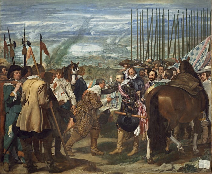
Diego Velázquez, “The Surrender of Breda” (“Las Lanzas”), 1634–1635, oil on canvas, Museo Nacional del Prado, Madrid, Spain.

A painting for a declining empire

The year is 1625, and the Spanish Empire is at its apogee.

So far, “Spain had been steadily losing the Eighty Years’ War against the Netherlands” (Dorsey 12). But a surprising turn of fortune happens: in what is now the Netherlands against the Dutch Republic, a nine-month siege culminates in conquering the fortified city of Breda. Under the leadership of the remarkable General Ambrosio Spinola, King Philip IV of Spain and his Army of Flanders has scored a decisive success in capturing the city. The equally brilliant Dutch general Justinus van Nassau surrendered Breda after heavy losses, the Dutch are pushed away from the hinterland, and fewer than 3,500 Dutch soldiers survive the siege (Duffy 96). It shows Europe that Spain is still a formidable fighting force; “Spain is victorious,” it says triumphantly, “Spain will conquer the Dutch revolt.”

The victory, though, is ultimately a pyrrhic one. As David Dorsey writes:

Spain lost Breda only a few years after the surrender and went on to lose the entire war in 1648. This moment in 1625 was only a brief setback for The Netherlands. From here onward, the declining Spanish Hapsburg empire gradually ceded its primacy on the world stage to another rising imperial star: the Dutch (Dorsey 12).

In a little over two decades, Spain will suffer grave political losses in the Peace of Westphalia, which guarantees independence to the Netherlands. “The regime of… Philip IV,” writes Peter Schjeldahl, “… was overstretched abroad, sclerotic at home, and, what with the Dutch and English predation on its shipments… often broke. The Golden Age of Spanish art and literature… was sputtering out” (Schjeldahl 11). Indeed, the Dutch ended up recapturing Breda in 1637, two years after this painting was finished.

But we are not there yet. We are still in a period when Spain feels confident and triumphant. And, when Philip IV begins to build a new palace outside of Madrid, the Buen Retiro, in the early 1630s, Spain’s power, though increasingly diminishing, still remains. The war is not lost just yet.

One series of commissions in particular stands out: “a series of twelve paintings for the Hall of Realms, where royal audiences and other ceremonies took place,” depicting, by the hands of different artists, “recent Spanish victories, some won just a year or two earlier” (Annenberg). Artistic greats such as Zurbarán and Castello are called in from Italy and Castille. And the King gives the commission for the greatest Spanish military triumph in recent memory, the surrender of Breda, to the court’s most prestigious and illustrious painter, Diego Velázquez.

By this point, Vélazquez was very safely ensconced within the favor of the court of Philip IV. He never lacked commissions or offers, and was indeed friendly with both the King and Queen; “No other painter in history was better situated than Velasquez,” says Dorsey, “to paint the life of empire and the tenuous nature of political power” (Dorsey 12). It is no surprise, then, that Vélazquez obtained this most important commission for the Hall of Realms.

And he delivered. The Surrender of Breda (often called Las Lanzas for the prominence of the wall of Spanish lances pointing to the sky) is still considered “one of the most famous and accomplished war pictures in the history of art” (Wolf 22). But its value doesn’t come entirely from its impressive depiction of individuality and surface texture; rather, Vélazquez’s brilliant balancing of humanity, power, and propaganda lends his work the quality of a masterpiece.

The merciful surrender
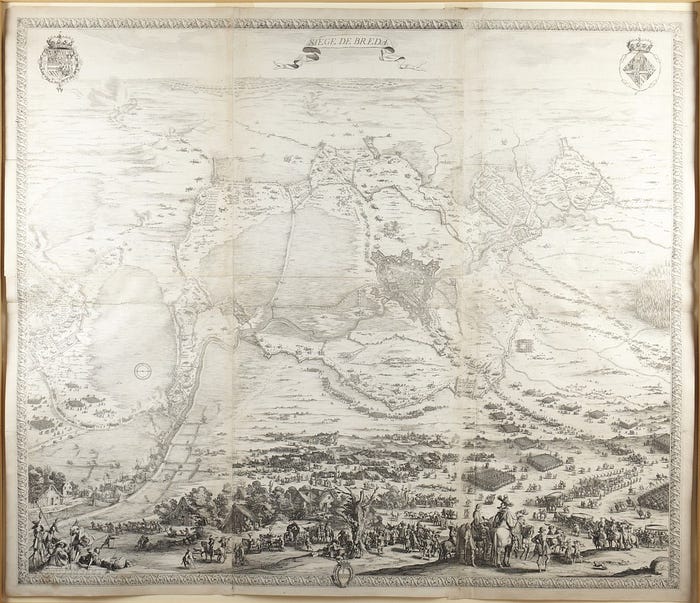
Jacques Callot, “The Siege of Breda”, 1628, etching, Princeton University Art Museum, Princeton, USA.

It is difficult to overstate just how important the successful Siege of Breda was to the Spanish and their spirits. The surrender, after all, was “a rare late success for the Spaniards in the war” (Schjeldahl 11). Breda’s extraordinary importance in Brabant made the Spanish triumph especially significant. News of the victory spread throughout Catholic Europe quickly and was met with great joy, as Norbert Wolf writes:

Many contemporary witnesses felt sure that the long struggle for the Netherlands would determine the future position of Spain… and the strategic significance of the place [Breda] was correctly assessed by Philip IV’s best commander in the Thirty Years’ War, Ambrosio Spinola… After a four-month siege and when all the provisions in the fortress had run out, he [Justinus van Nassau, the commander of the fortress of Breda] was forced to petition for an honorable surrender. Spinola allowed him to leave under conditions that were extremely generous for the period…

News of the victory was greeted with relief and delight in Madrid, and by Pope Urban VIII in Rome. The Pope congratulated Spinola on washing his hands in the blood of the heretics (Wolf 22).

What made this surrender in particular remarkable was that the Spanish commander, the brilliant General Ambrosio Spinola, was incredibly merciful, or rather magnanimous, to the defeated Dutch, and especially to the Dutch commanding officer, Justinus van Nassau. Normally, surrender was a humiliating act of the vanquished; “the tradition of surrender scenes,” writes Professor Jonathan Brown, was one “where the winning general sat upon the horse, in front of him was the kneeling losing general, who handed over the keys to the city to the victorious general” (Annenberg). But, according to Dorsey,

Eyewitnesses said Spinola dismounted in order to greet Nassau as an equal and saluted him as he approached. It was reported that he praised Nassau’s courage and his people’s endurance, during the siege. Spinola’s behavior would seem to be history’s noblest act of what we’d call good sportsmanship. There were no victory dances in the end zone here. Only a scene in which the victor humbles himself before the vanquished (Dorsey 12).

But, although this was a uniquely kind and surprisingly warm gesture towards the vanquished enemy, Spinola hid another gesture within that of mercy: one of magnanimity. That Spinola chose to be generous with the Dutch indicates not only military power but, in willful mercy, also displays a kind of moral superiority over the enemy. Comparable with the Roman depiction of the Dacians in Trajan’s Column, the message in this battle was not one of degrading and utterly humiliating the enemy (as was previously the case in surrenders); rather, it was one of carefully chosen magnanimity and, by extension, Spanish excellence.

We must also note here that Velázquez was intimately connected to General Spinola himself; indeed, the two were good friends and had previously traveled to Italy together. Spinola “died a few years before the commission of the painting” (de Dios 15); it is no surprise, then, that Velázquez wanted to especially emphasize the magnanimity and kindness of Spinola the man, making The Surrender of Breda a kind of tribute for his friend.

With such an emphasis on the mercy and moral superiority of the Spanish, then, in the battle itself, Velázquez’s composition naturally parallels and magnifies this emphasis. The painting overwhelmingly emphasizes the magnanimity of the Spanish over the defeat of the Dutch or the raw military power of the empire.

A painting about magnanimity
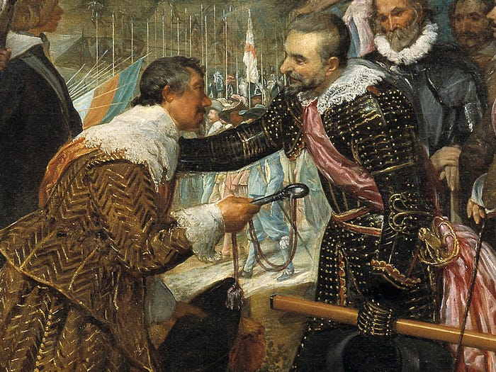
Diego Velázquez, “The Surrender of Breda” (detail), 1634–1635, oil on canvas, Museo Nacional del Prado, Madrid, Spain.

For all its magnificence and detail, The Surrender of Breda, when broken down, has a surprisingly simple composition. Velázquez essentially breaks the painting into two halves of military groups, placing the defeated Dutch on the left and the triumphant Spanish on the right. “Though the painting depicts a military victory,” Dr. Jimena Berzal de Dios writes, “Velázquez removed the bloody and violent aspects of the battle from the canvas” (Dios 15), simultaneously deemphasizing the violence and brutality of the Spanish siege while highlighting the specific moment of the aftermath of the battle. The only signs of the war are shown in the silent battlefield in the distance, smoke rising from fires far away.

Velázquez makes a clear visual distinction between the two groups of soldiers. On the right, the Dutch soldiers stand, weather-beaten, disorganized, and few. “The group of defeated men,” writes Wolf, “is constructed more loosely and with more variety of lighting and colour than the well-disciplined company of victors” (Wolf 22). They provide a distinct foil to the Spanish troops on the right, “presented as a large, well-organized, and seasoned group” (de Dios 15). In sharp contrast to the Dutch, the Spanish soldiers seem more elegant, more competent, and more victorious.

Velázquez emphasizes the might of the Spanish particularly strongly in the depiction of the lances, a veritable forest of dense spikes pointing to the sky. They dominate the Spanish half of the composition, and serve to both “create a sense that there are more Spanish troops than we can actually see” (de Dios 15) as well as emphasize the military superiority and competence of the Spanish. The Dutch pikes are few and crooked; the Spanish lances are ordered, straight, and greater in number. This dense forest of lances so dominates the overall composition that it gives the painting itself its well-known subtitle, Las Lanzas. The order and military might of the Spanish military also provide a subtle foil to the generous and merciful act that happens in the center of the painting, the central act of the moment, to which the viewer’s eyes are inevitably drawn.

The massive composition is centered on a slight, momentary gesture of kindness. Justinus van Nassau, his head slouched wearily and bowing before Ambrosio Spinola, proffers the keys of the city to the Spanish general. Spinola bends down to van Nassau and lays his hand on his shoulder tenderly, almost affectionately, and looks at him with a slight smile, “a sympathetic and a noble gesture” (Wolf 22). De Dios writes that Spinola puts his hand over van Nassau’s shoulder “most likely in order to stop him from kneeling” (de Dios 15), further emphasizing the human tenderness and the surprising mercy of the moment. Perhaps Spinola says something to the defeated general, who looks up and meets his eyes in surprise; his rod of command and hat, both symbols of authority, dangle from his hand as if forgotten at the moment.

This momentary gesture of kindness and affection is the clear center of the entire painting; Velázquez deemphasizes the battle itself (only painted in the distant background, almost as an afterthought) in favor of Spinola’s, and Spain’s, magnanimity, shown in this singular moment. “The entire composition,” as the painting’s page on the Prado says, “is designed to emphasize this gesture, and both the group of Dutch soldiers… and the Spaniards serve to frame, accompany and shelter this principal motif, drawing our attention directly to it” (Prado). The visual message here isn’t one of triumphant victory, but one of the mercy of the Spanish, shown “with extraordinary efficiency” (Prado) in the depiction of this gesture that must have lasted mere seconds.

By depicting a singular moment in time (one recalls Caravaggio’s hic et nunc philosophy) in remarkable visual detail, Velázquez makes the viewer feel as if they are a witness to the surrender as well. The photorealistic detailing of the armor of Spinola and van Nassau, the remarkable individuality of all the soldiers present in the composition, and Velázquez’s “inexhaustibly rich orchestration of their feelings and their states of mind” (Wolf 22) all serve to make the scene as realistic as can be. His brushwork and color is impeccable in its realistic technique:

Velazquez achieves… a new perception of light and a subtle counterposition of luminous colored planes… Matter has become impalpable, seeming to soak in light and at the same time radiate it, achieving a sensation of palpitation, of true life, created not through tactile techniques—outlines are no longer sharply defined—but rather through exclusively visual means (Ortiz et al. 89).

Especially noteworthy here is the fact that Velázquez removed all allegorical or mythological references to victory or triumph, making the work “indisputably the first purely historical picture in modern European painting” (Wolf 22). Such lack of symbolism further reinforces the main message of the work, which is definitively not concerned with military triumph. “As numerous scholars have pointed out,” the Prado says, “this is no ordinary pictorial celebration of victory or martial ideals” (Prado). Velázquez concentrates our attention on the foreground, to the scene of the triumphant general reaching out in surprising kindness.

If Spinola is talking to van Nassau in this second, what does he say? Opinions differ. Perhaps he says something along the lines of “‘Don’t bow down to me, friend. We are one and the same, you and I. Our enemy is everything that’s happening around us’” (Dorsey 12). Or maybe “he says something like ‘We both know that this is only the outcome of today’” (Schjeldahl 11). Perhaps the gesture is one of “destined consent” (Koppelman 16), as Eli Siegel commented on the work. Or maybe “the hand he places on his opponent’s shoulder is ambivalent—a concurrent show of respect and condescension” (Annenberg).

We just don’t know. But I like to imagine Spinola’s gesture as one that goes beyond kindness and into comforting the enemy general; an unprecedented act of affection that speaks volumes in mercy and magnanimity. Or, at least, that’s what Velázquez wants us to see.

The work as propaganda
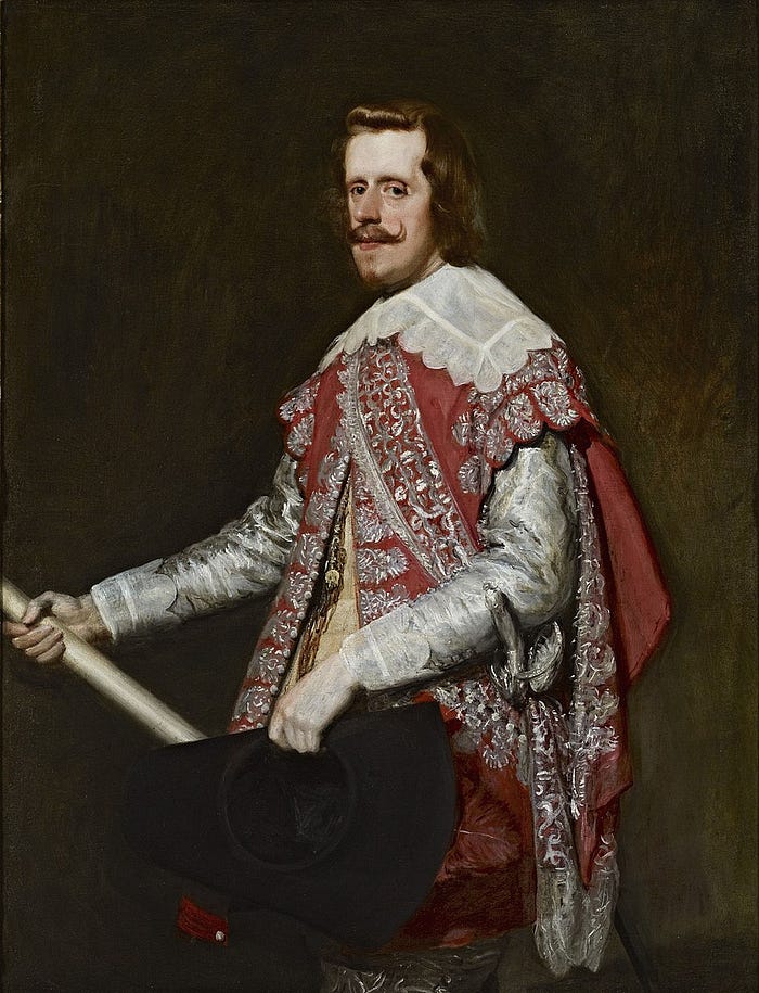
Diego Velázquez, “Portrait of Philip IV in Fraga”, 1644, oil on canvas, The Frick Collection, New York City, USA.

As much as we would like to imagine otherwise, this emotionally moving meeting between Spinola and van Nassau never actually happened. Indeed, though many details of the composition (the armor, the flags, the equipment, etc., etc.) are drawn from Velázquez’s research and real life, the truth is that Spinola’s magnanimous gesture and van Nassau’s humility are fictional. As Jimena Berzal de Dios writes,

… we should not let Velázquez’s naturalistic style deceive us. The Surrender of Breda is not a faithful reproduction of the event. It is highly unlikely that the encounter between the two commanders took place as depicted. The painter, who was not present at the siege of Breda, carefully constructed the scene to commemorate Spinola’s magnanimous character, not to document an event…

The painting presents a humane encounter in the midst of the chaos and cruelty of war. But we should not think that there are no ulterior motives for the presentation of this seemingly virtuous moment (de Dios 15).

The aim of the painting, in its emphasis on magnanimity and Spanish moral superiority, becomes clear in its original context, within the halls of the Buen Retiro. Recalling the fact that the Hall of Realms was where royal receptions and ceremonies took place, it becomes clear that The Surrender of Breda is, at its core, a propagandistic painting. Its message is one of mercy and magnanimity rather than of Spanish military power, yes, but none of its purposes include naturalistically and realistically depicting an actual event. The painting “operates at multiple levels: it is a rhetorical exaltation of Spanish national identity, a symbol of Philip IV and his army, and a tribute to Spinola” (de Dios 15). Indeed, this is true of the other paintings commissioned for the Buen Retiro:

The Surrender of Breda and the other images in the Buen Retiro series served a dual purpose. On the one hand, they offered evidence of Spain’s power to contemporary audiences; on the other, they commemorated the success of Philip’s reign for posterity. In order to meet these objectives effectively, they sometimes played with the facts (Annenberg).

The “point” of The Surrender of Breda shows itself clearly. It isn’t depicting a historical event accurately and truthfully; rather, it’s extolling the magnanimity and power of General Spinola, and, by extension, the greatness of Philip IV and the Spanish Empire as a whole. That Velázquez was able to depict such abstract concepts as honor and magnanimity so efficiently is less a degradation of his work (just because a work is propaganda doesn’t mean that it’s necessarily “bad”!) than it is a testament to his genius. In the words of the Prado: “the simple gesture of the two generals is enough to transmit a theory of State and a view of history” (Prado).

“I was so moved by these two men,” says Dorothy Koppelman, “taking their hats off to one another, that I wanted to be like them, yielding and victorious” (Koppelman 16). Perhaps that is the key to The Surrender of Breda: an emphasis on the beauty of submission and pride, the triumph of magnanimity and mercy, the inherent power within choosing to refrain from exercising power.

Did The Surrender of Breda “work”? Probably not. At the end of the day, Velázquez and Philip IV took a gamble in depicting the triumph of an event “that had not yet withstood the test of time” (Annenberg) in decorating the Buen Retiro. And they lost that gamble: within scarcely a decade, Spain’s position on the continent was lost, its dominance lost to the English, the French, and the Dutch. Within two years, most of Spain’s victories in Brabant and Flanders, including Breda itself, were reversed for good. The Buen Retiro was ruinously costly and ended up becoming “a sepulchre of imperial dreams” (Schjeldahl 11); Philip IV’s passion project was razed during the 19th century, leaving behind what is today the Retiro Park in Madrid. And Spain itself sank into a constant economic plunge, plagued by bankruptcy and a parasitic nobility.

But, timelessly, The Surrender of Breda still “works” for us. Velázquez’s effect of magnanimity and his message of Spanish moral superiority still speak to us; more importantly, the tenderness of the composition still takes us by surprise and invites us, almost as eyewitnesses, to this singular moment in time. Velázquez’s unique ability to apply a distinct message with his talent for applying paint perpetuates a fictionalized past that, almost four centuries later, still feels present and real. Peter Schjeldahl is entirely correct when he writes that “He conquered time” (Schjeldahl 11).

The Spanish Empire lost the Eighty Years’ War, and its Golden Age died soon after Velázquez completed this work. The victory at Breda was all too fleeting, and both Spain and the Buen Retiro fell into decline. But we can forget all of that when we look at this fictional hill on the outskirts of Breda, when we see epic intimacy and the triumph of ordinary humanity in the slight, kind gesture of a simple hand on the shoulder. Velázquez’s ontology of history is ever present, ever real. The Surrender of Breda continues to speak in the present tense; Spinola still comforts van Nassau with the soldiers and the lances, and the power of magnanimity confronts us, infinitely here.

Sources cited

Duffy, Christopher. Siege Warfare: The fortress in the early modern world, 1494–1660. Routledge, 1996.

Wolf, Norbert. Velázquez. Taschen, 2022.

Ortiz, Antonio Domínguez, et al. Velázquez. The Metropolitan Museum of Art, 1989.

Koppelman, Dorothy. “What Will Make Us Truly Proud of Ourselves? A Study in the Art of Diego Velázquez.” Terrain Gallery, 10 January 2016, https://terraingallery.org/aesthetic-realism-art-criticism/what-will-make-us-truly-proud-of-ourselves/.

de Dios, Jimena Berzal. “Diego Velázquez, The Surrender of Breda.” Smarthistory, 8 August 2015, https://smarthistory.org/velazquez-the-surrender-of-breda/.

“Art: Surrender of Breda.” Annenberg Learner, 22 March 2019, https://www.learner.org/series/art-through-time-a-global-view/history-and-memory/surrender-of-breda/.

The Surrender of Breda.” Museo del Pradohttps://www.museodelprado.es/en/the-collection/art-work/the-surrender-of-breda/0cc7577a-51d9-44fd-b4d5-4dba8d9cb13a.

Dorsey, Dave. “Awakening from the nightmare of history.” Represent the Painting Life, 10 February 2012, https://thedorseypost.com/?p=1076.

Schjeldahl, Peter. “The Reign in Spain.” The New Yorker, 25 December 2011, https://www.newyorker.com/magazine/2012/01/02/velazquez-the-reign-in-spain-peter-schjeldahl.
a tale of two churches: notes on the sagrada família and santa eulalia cathedral

The following article is from our family’s travel blog, arttravel.me. It was written by me.
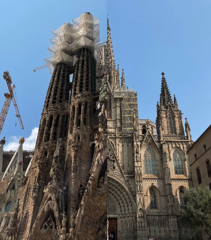
Left to right: Sagrada Família, Santa Eulalia Cathedral.

Introduction

If you ask, “What are the two most important cathedrals of Barcelona?” to anyone, they will probably answer by naming the Sagrada Família Basilica and Barcelona Cathedral (referred to here for clarity as Santa Eulalia Cathedral). And no wonder: one is Barcelona’s number one tourist attraction, bringing over three million visitors yearly, while the other was the city’s cultural and historical heart for centuries.

Which is odd, given that the two churches, at least at first glance, are wildly different from each other. One is 13th to 15th century; the other is 19th to 21st. One is primarily Gothic and neo-Gothic; the other is a riotous blend of architectural styles, described varyingly as Late Gothic, Catalan Modernist, or Art Nouveau. One is the classic image of a cathedral, imposing and austere; the other is colorful, richly decorated, and, famously, unfinished.

Given these differences, is it possible to draw any parallels between these two seemingly opposite buildings?

Exteriors

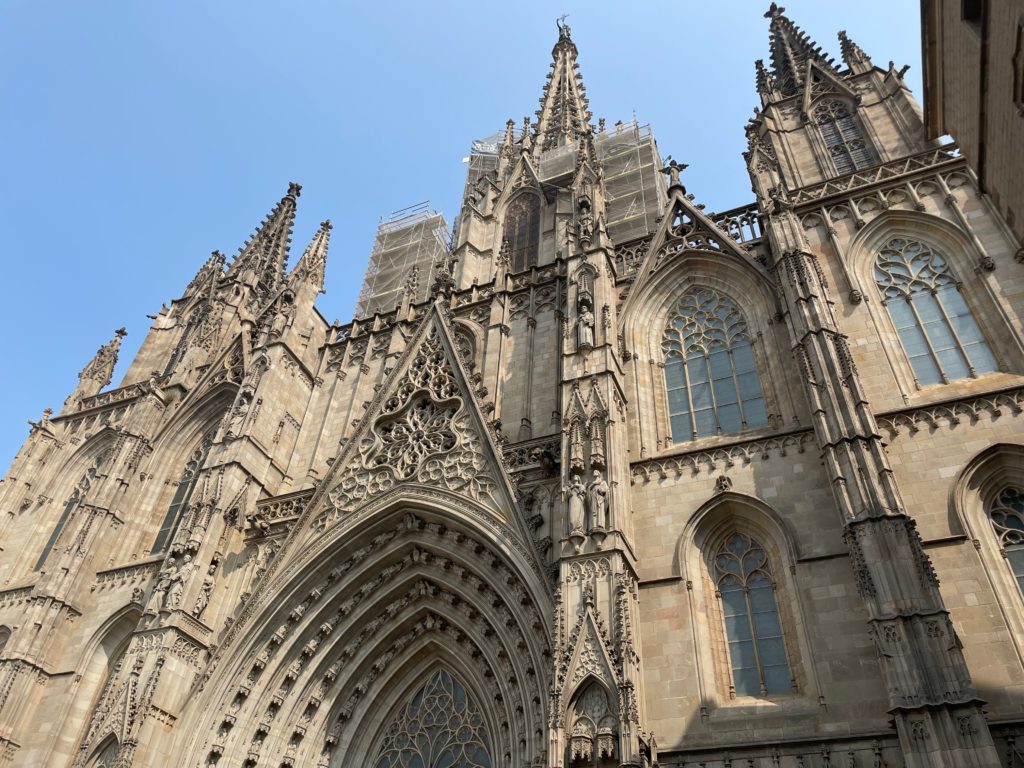
Santa Eulalia Cathedral, front façade; seen from Plaça Nova.

Of course, the part of any cathedral (and indeed, most buildings) that immediately captures the eye is the front face, of the façade. It’s also the most photographed part of the cathedral; when we visited the Sagrada Família, the spaces in front of the façades were absolutely packed with tourists snapping selfies. Although Santa Eulalia was considerably less crowded, this might have had more to do with the time we visited the cathedral (around 5 PM), as well as the considerably roomier space in front of Santa Eulalia.

We’ll start with Santa Eulalia. The front façade is unquestionably neo-Gothic, with its triple spires, its intricately carved panels, and its placement of the statues of saints… all quintessentially Gothic. I say neo-Gothic, though, because the façade actually doesn’t date back to the time the cathedral was built. In fact, the thirteenth-century western face was surprisingly simple until the late nineteenth century, when the spires were added. Overall, the façade is a classic example of the neo-Gothic.

The Sagrada Família, of course, is much more complicated than this, with its unique quirk of having three façades, all with their own unique design styles and architecture. Let’s start with the oldest face, the Nativity façade—the only face to have been completed in the lifetime of the architect, Antoni Gaudí.

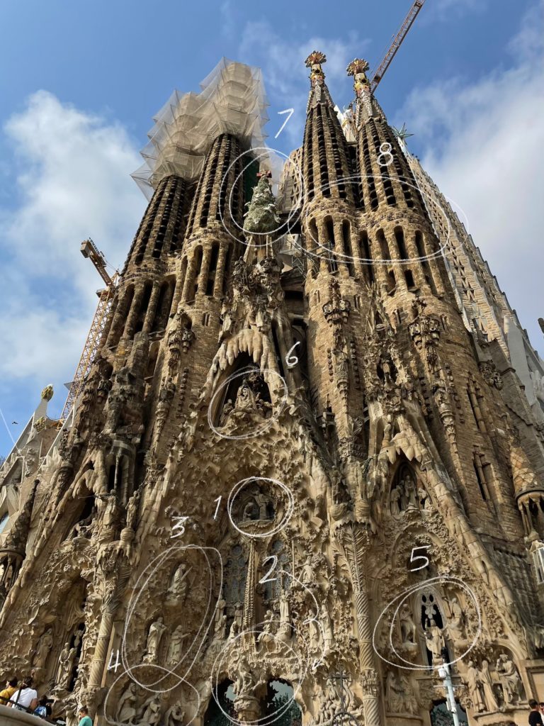
Sagrada Família, Nativity façade.

A common mistake many visitors make is the assumption that Antoni Gaudí was spiritually avant-garde, deviating from orthodox Catholic teachings, or that he was not spiritual at all. Nothing could be further from the truth. Throughout his entire life, Gaudí was a devout, sometimes fanatical, Catholic. The influence his faith had on his works can best be seen in the Nativity façade because this is the only façade that Gaudí lived to see completed. It can thus be said to be a genuine example of the architect’s vision for the basilica.

Teeming with depictions of flora and fauna, the Nativity façade is full of life and celebrates the birth of Christ. The narrative of the nativity, starting from the Annunciation (1) to the birth of Jesus (2), accompanied by a band of angels (3) and the three wise men (4), then moving on to the young Christ in the temple (5) and a humble image of the holy family (6), before being capped by a colorful cypress tree surrounded by doves (7) and the four towers bearing the word “Sanctus” (Latin for “holy”) (8), is carved with meticulous detail from stone, with many of the statues being cast from life through plaster. From painstakingly accurate depictions of people, leaves, animals, and angels, to the overall exuberance of the design, the façade feels celebratory. The overall effect of the face is one of joy and celebration of the birth of Christ.

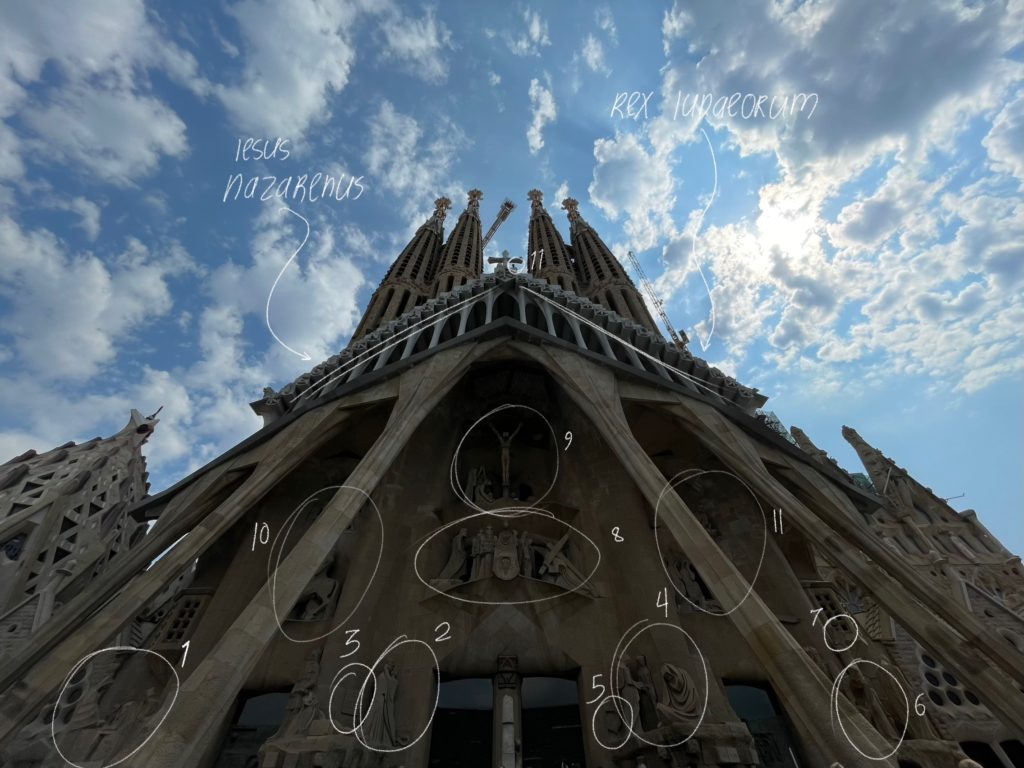
Sagrada Família, Passion façade.

In stark contrast to this vibrant and richly detailed face, the façade opposite to this, the Passion façade, is austere, bare, and sharply angular. This face of the cathedral was constructed far after Gaudí’s death, and the differences show: where the Nativity façade, telling the story of the Messiah’s entry into the world, is joyful and ornate, the Passion façade, telling the story of the Messiah’s brutal death, is bare and architecturally morose.

Like the Nativity façade, this face too primarily tells a story. The pillars are angular and resemble tendons or muscles, representing the physical aspect of Christ’s suffering. The narrative goes from the left to the right, then toward the very top. We start from the last supper (1), then towards the right to the infamous Kiss of Judas (2); the famous magic square (3) is also present, with all numbers in any direction adding up to the number 39, the age of Jesus when he died. (4) shows Peter’s denial of Jesus, with the apostle’s face wrought in grief; the rooster that crowed thrice (5) before Peter’s denial is also shown. Then it’s on to Pontius Pilate (6) deliberating during Jesus’ trial, with the Roman eagle (7) also shown.

Above the main doors, Christ’s walk to Golgotha, bearing the heavy cross, is shown (8), before the final suffering of the crucifixion (9). A stylized Roman soldier (10) and the burial of Jesus (11) are also shown. And above the whole façade, the words “Iesus Nazarenus Rex Iudaeorum” are written: this is Latin for “Jesus Christ, King of the Jews”, and was the message written above Christ’s head when he was crucified. But even in this bleak story, hope is not lost: a small statue of Jesus (11) is perched in between the four towers, representing his ascent into heaven.

And finally, although we didn’t have a chance to see the final, main face of the Sagrada Família, the Glory façade, construction on it has barely started, so we really didn’t miss much.

Overall, the faces of the Sagrada Família are much more narrative-driven than the façade of Santa Eulalia; whereas the faces of the former are built with the purpose of telling a grand, overarching story, the face of the latter was built with decoration in mind, not with narrative. And while the façade of Santa Eulalia is built with a single style, every face of the Sagrada Família is different.

This speaks to the length of time it took to build the respective façades. The unity of style present in the face of Santa Eulalia is unusual in most Gothic cathedrals; it’s due to the comparatively short time it took to build the façade separately. The opposite is true in the Sagrada Família, where the unity of style in the three faces of the building isn’t present because of the time it took to build them.

Interiors

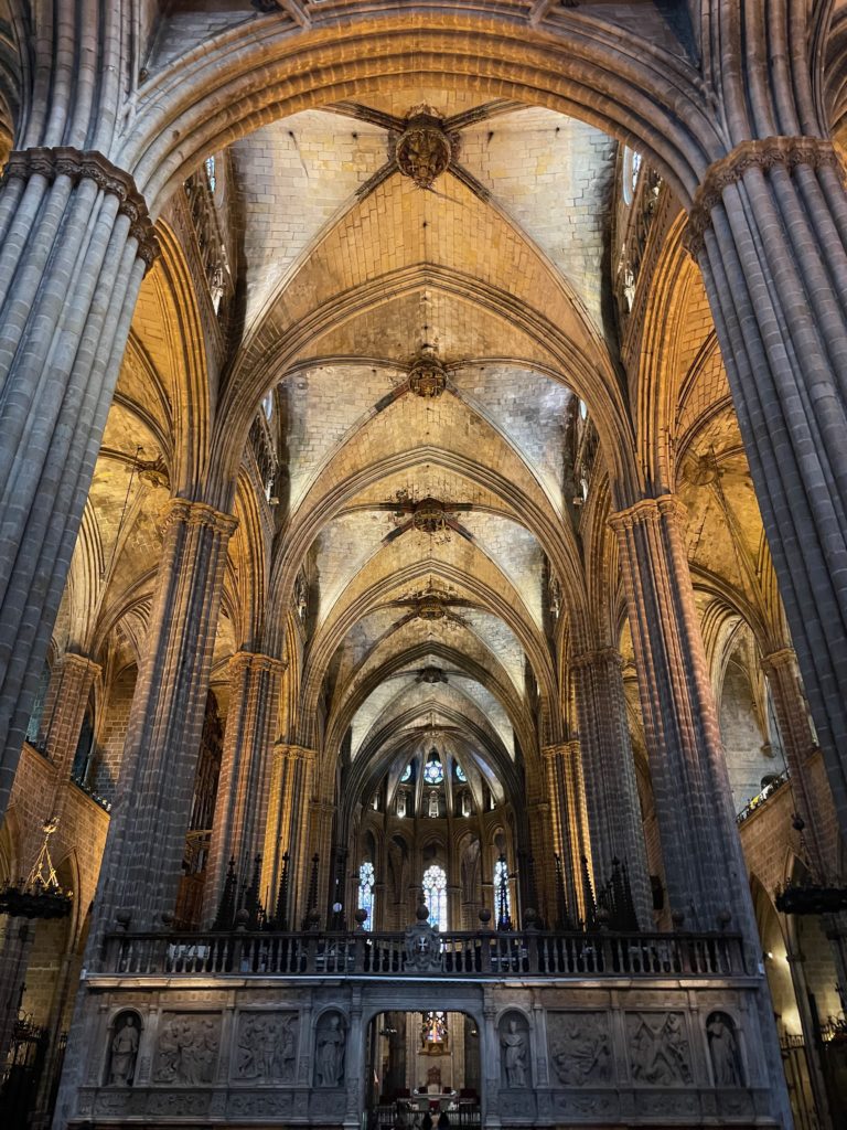
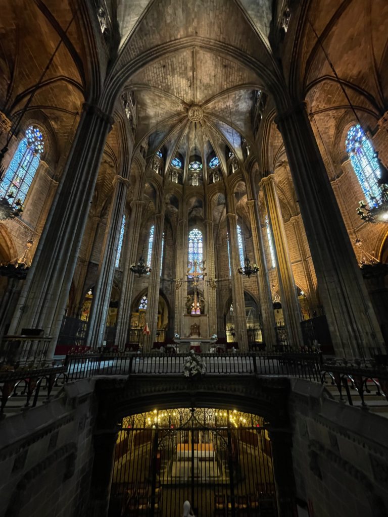
Nave of Santa Eulalia Cathedral, viewed from the entrance towards the apse.
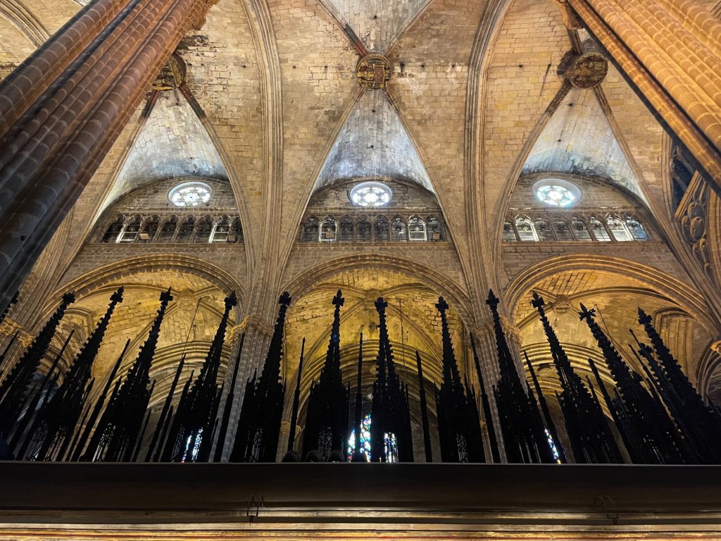
Detail of the ceiling of Santa Eulalia Cathedral. Note the rib vault structure.

Visiting Santa Eulalia, we are immediately greeted by the nave, the vertical part of the cathedral’s cross structure, since the main entrance is there. The giant columns, stacked in tiers, support a brick rib-vaulted ceiling, a classic hallmark of Gothic cathedrals. The pointed Gothic arch is prominent throughout the building; some natural light comes through the windows, more prominently in the apse than in the nave, but most of the lighting is artificial. The interior of the cathedral seems dark, almost gloomy: this may be because of the cathedral’s position in Barcelona’s Gothic Quarter, where it is surrounded by buildings that block natural light from coming through the windows.

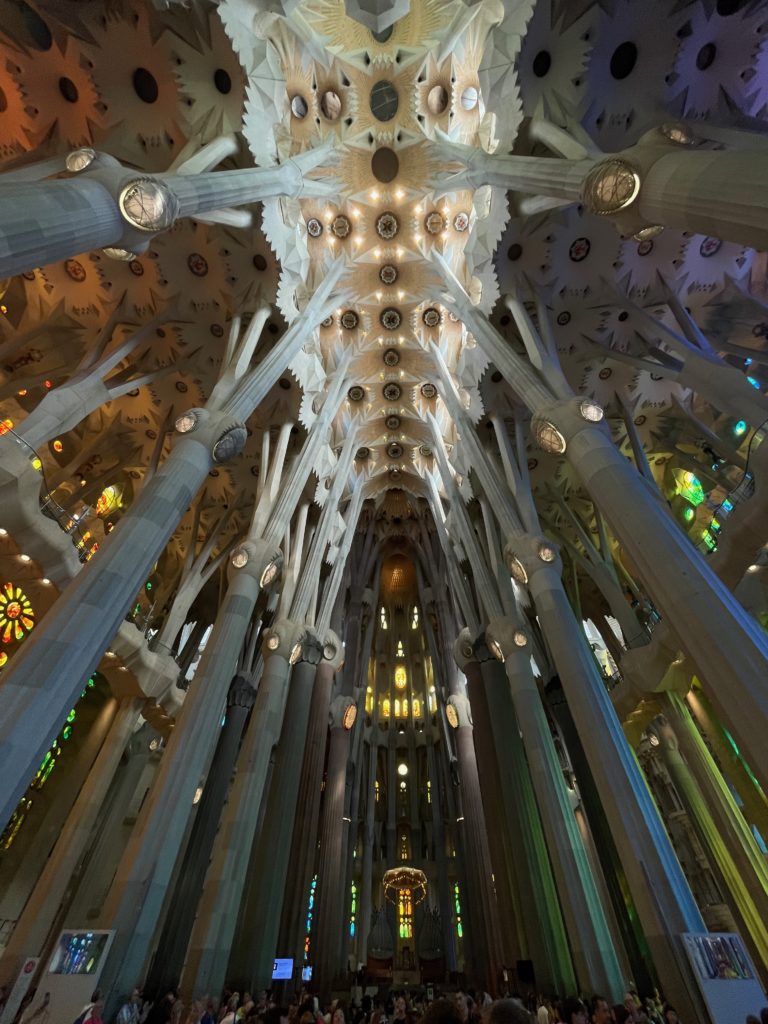
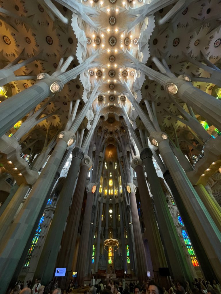
Detail of the ceiling of the Sagrada Família. Note the more naturalistic, “flowering” design.

In contrast to Santa Eulalia, the main entrance of the Sagrada Família is at the transept (the Nativity façade is at the right side of the transept), so visitors have to walk to the front of the cathedral to view the nave, as the main doors have not been opened yet. The most striking aspect of the Sagrada Família is unquestionably its color, coming from the Barcelona sunlight that passes through vibrantly colored stained-glass windows; it’s unquestionably natural, which may be due to the basilica’s position in the more rigidly planned Eixample district, where it towers above many residential buildings; more light can thus filter through, allowing for a brighter interior than that of Santa Eulalia.

Another striking detail is the design of the columns; unlike the classic tiered stone pillars that hold up pointed arches in Santa Eulalia, the columns of the Sagrada Família branch out towards the top and support a flowered ceiling (or perhaps a symbolic representation of a canopy of leaves) and, towards the top, a series of catenary arches. This design, combined with the fact that the sheer height of the basilica makes the columns look slender—in reality, they are incredibly wide—gives the feel of a stone forest, where the columns become naturalistically designed trees supporting fluid and non-rigid structures.

Stained glass windows of Santa Eulalia Cathedral, seen from the choir.
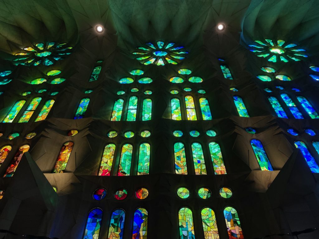
Stained glass windows of the Sagrada Família, seen from the nave side aisle.

Despite these differences, there are similarities between Santa Eulalia and Sagrada Família. The most prominent of these are the windows; both have fine stone tracery and a “rose” design, another hallmark of Gothic stained-glass windows. The windows of the Sagrada Família are overall more colorful, with a far greater selection of shapes and pieces than the windows of Santa Eulalia. However, they do feature the shape of the Gothic arch, in contrast to the catenary arches that are prevalent throughout the basilica.

Apse of Santa Eulalia Cathedral.

Moving to the front of the cathedral, we come to the apse, perhaps the most important part of any cathedral: this is where services are held, where the speakers preach, and where the high altar is found. 

For Santa Eulalia, the continuity of the space of the apse is partially disrupted by the entrance to the crypt, which is unusually in the open and sudden. This is where the namesake of the cathedral, Saint Eulalia, is buried. Behind the entrance is the apse proper, where the altar is. Compared to other cathedrals we visited, such as Toledo Cathedral, the apse of Santa Eulalia was surprisingly sparse; the main visual highlight of the space is the hanging sculpture of the crucified Christ surrounded by angels. The round walls of the apse feature lovely stained-glass windows, featuring the aforementioned tracery and rose shape of the classic Gothic style. 

Apse of the Sagrada Família.

As a basic starting point, the apse of the Sagrada Família—indeed, the entirety of the Sagrada Família—is far larger than that of Santa Eulalia. As such, the apse simply feels more impressive; combined with the effect of the technicolor stream of light, it contrasts sharply with Santa Eulalia. 

In the center of the apse is a hanging baldachin, or the canopy under which the bishop sits. Under it is another depiction of the crucifixion; coincidentally, it also floats off the ground in an almost abstract form. Behind the altar space are two organs, not present in Santa Eulalia, which play every half-hour or so. The sound of the pipes echoing through the basilica is a truly ethereal experience. Finally, the crypt, where Gaudí himself is buried, is situated directly under the apse, with a much subtler entrance than Santa Eulalia. 

The traditional structure of the apse, that is, the reservation of the focal point of the nave and transept for the holiest space of the church, is the common tangent that ties the spaces of the two buildings together. Besides the altar, the hanging sculpture of the crucified Christ, and the elevated platform, it may seem hard to draw parallels between the two spaces. After all, Santa Eulalia doesn’t have the double organs that the Sagrada Família boasts; nor does it have the uninterrupted seating space that allows all eyes from the nave to be drawn to the apse.

But although these differences are important, it’s also important to note the many common architectural points that Antoni Gaudí intended in his work. As mentioned previously, the stained-glass windows are similar throughout the two buildings; the similarity is most prevalent in the apse, where the tracery and rose shapes especially shine through. And no wonder: in both buildings, the apse is the brightest part of the church. Finally, in both buildings, one of the most important people of the church is buried directly under the apse. For Santa Eulalia, it is its namesake; for the Sagrada Família, it is its architect. An affirmation of Christ’s triumph over death, perhaps, or a sign of honor. 

Concluding thoughts

Santa Eulalia Cathedral and the Sagrada Família: Barcelona’s two great churches. One is a hallmark of medieval Gothic, the other is a hodgepodge of different styles over different decades. One is dark and solemn, the other is bright and airy. One is smaller and attracts fewer, the other is larger and attracts multitudes more. The differences go on.

Make no mistake, though: both are firmly grounded in Catholic tradition, architectural stability, and above all, faith. Though they may express it in radically different ways, at the end of the day, both buildings deserve a judgment on equal footing. They are both, in their own ways, beautiful statements of belief.

This article is based on our visit to the Sagrada Família and Santa Eulalia Cathedral on June 27th and 28th, 2023, respectively.

where cultures collide: notes on toledo cathedral

The following article is from our family’s travel blog, arttravel.me. It was written by me.

Introduction

Before Philip III moved the capital of Spain to Madrid in 1561, the ancient city of Toledo, with its highly fortified riverside location and sturdy stone walls, was the original capital city of the Spanish Empire. Small wonder, then, that it boasts one of the greatest cathedrals in the world, the Primatial Cathedral of Saint Mary of Toledo (Catedral Primada Santa María de Toledo), also known as Toledo Cathedral.

Toledo Cathedral, seen from Plaza del Ayuntamiento.

Built for more than 250 years, the cathedral is a shining example of Spanish High Gothic architecture, although it incorporates aspects of the Baroque, Rococo, and Mudéjar styles as well. Today, Toledo Cathedral’s beauty and imposing grandeur continue to draw tens of thousands of tourists to the city, centuries after its stones were laid.

So what makes Toledo Cathedral so special, and how does it continue to attract and inspire people hundreds of years later?

Toledo

To properly understand Toledo Cathedral, we first have to look at the city of Toledo itself.

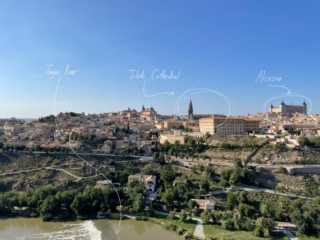
Toledo, seen from the Mirador Toledo.

As seen by the image above, Toledo sits on a hill facing the Tagus River, easily defensible by walls. This naturally advantageous position for a city was recorded as far back as ancient Rome; the Roman historian Livy writes of Toledo as “a small city, but fortified by location” as early as the first century AD. It is not surprising, therefore, that Toledo first served as the capital city of the Visigothic Kingdom from 542 to 725 AD, a period of almost 200 years; nor is it surprising that Holy Roman Emperor Charles V centered his court on Toledo. Indeed, Toledo was Spain’s de facto capital city until Philip III moved the capital to Madrid due to a lack of space.

As the greatness of the city grew throughout the years, the need for a grand cathedral arose. It’s important to remember that cathedrals in Europe are designed to be the focal points of their cities; they’re designed specifically to instill awe and grandeur in the viewers. So, considering both the illustrious history of the city and the need for grandiosity in cathedrals, the grandeur of Toledo Cathedral comes as less of a surprise.

Exterior

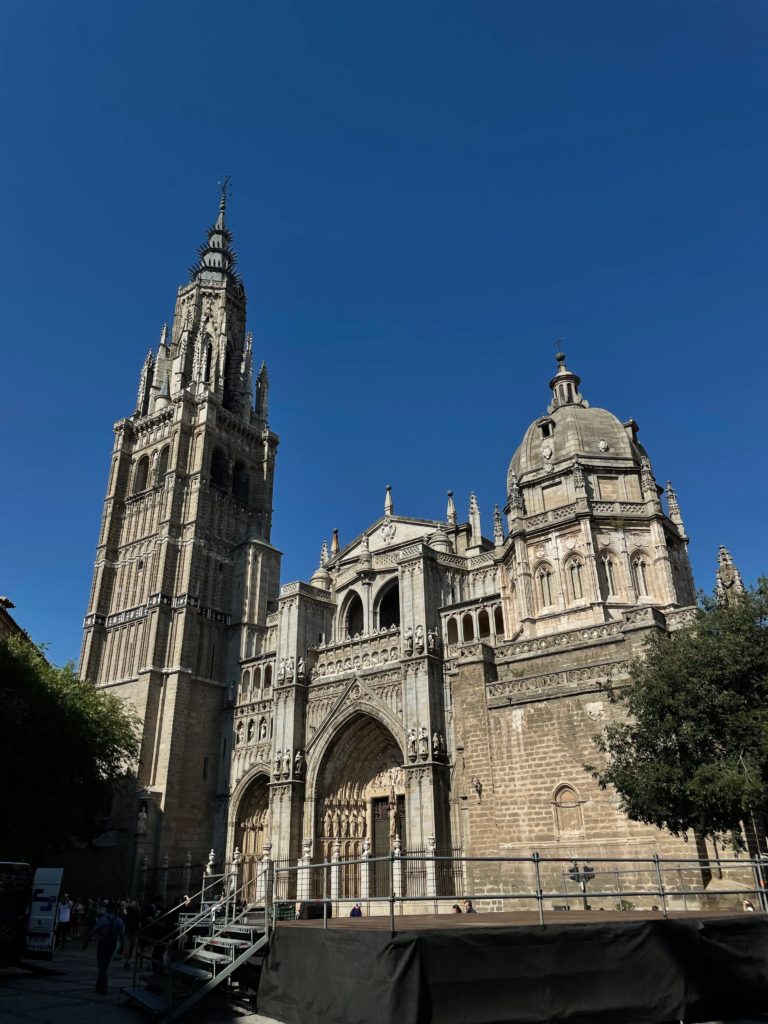
Front façade of Toledo Cathedral, seen from Plaza del Ayuntamiento.

Toledo Cathedral is often called the crowning glory of Spanish High Gothic architecture, and this title clearly shows in the exterior of the building, specifically in the front façade.

To start, the three-portal design of the front (1) is a very clearly Gothic form of cathedral architecture. The cathedrals of Notre Dame de Paris, Amiens, Rouen, and Reims, to name just a few, all have three portals. The trefoil designs of the arches (2), as well as the stone tracery of the arches, both are descended from the Gothic style. And of course, the classic Catholic iconography of carved images of Christ and statues of the saints in niches (3) speaks to the cathedral’s purpose.

On the other hand, some elements of the cathedral’s exterior are influenced by the Mudéjar style, which utilizes Islamic-derived elements in Iberian architecture. For example, the elaborately carved stone patterned railing on the top of the façade (4) is in the mudéjar style, as is the brickwork of the left belfry (5). Overall, however, the mudéjar style does not become immediately apparent from the front.

On the topic of the belfry, one of the more unusual aspects of Toledo Cathedral is its seemingly mismatched and asymmetrical towers. The taller tower on the left is a bell tower (6), but the tower on the right is a chapel (7) (whose octagonal dome was designed by Jorge Manuel Theotocópuli, son of the famous painter El Greco), used specifically to house a worship place for the Mozarabic rites. These rites were once used throughout the Iberian peninsula and were kept alive by the Christian communities under Muslim rule in Al-Andalusia, or the Mozarabs. The Mozarabic rite is still kept alive today, especially in Toledo, where the rite is still celebrated in the chapel to this day.

From the grand and elaborate front façade, we come into the interior of the cathedral itself.

Interior

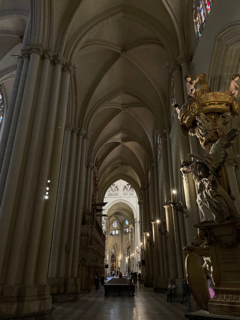
Interior of Toledo Cathedral, right side aisle, nave.

The nave of Toledo Cathedral is a quintessential example of High Gothic architecture. From the colossal columns supporting the rib vaults to the stained glass windows and the gigantic rose window, the front of the cathedral is almost entirely in the Gothic style. Here, the pointed shape of the Gothic arch is prevalent, as is the cross shape of the rib vault. The front is dark, almost gloomy, lit by artificial lights and sunlight streaming through the stained glass.

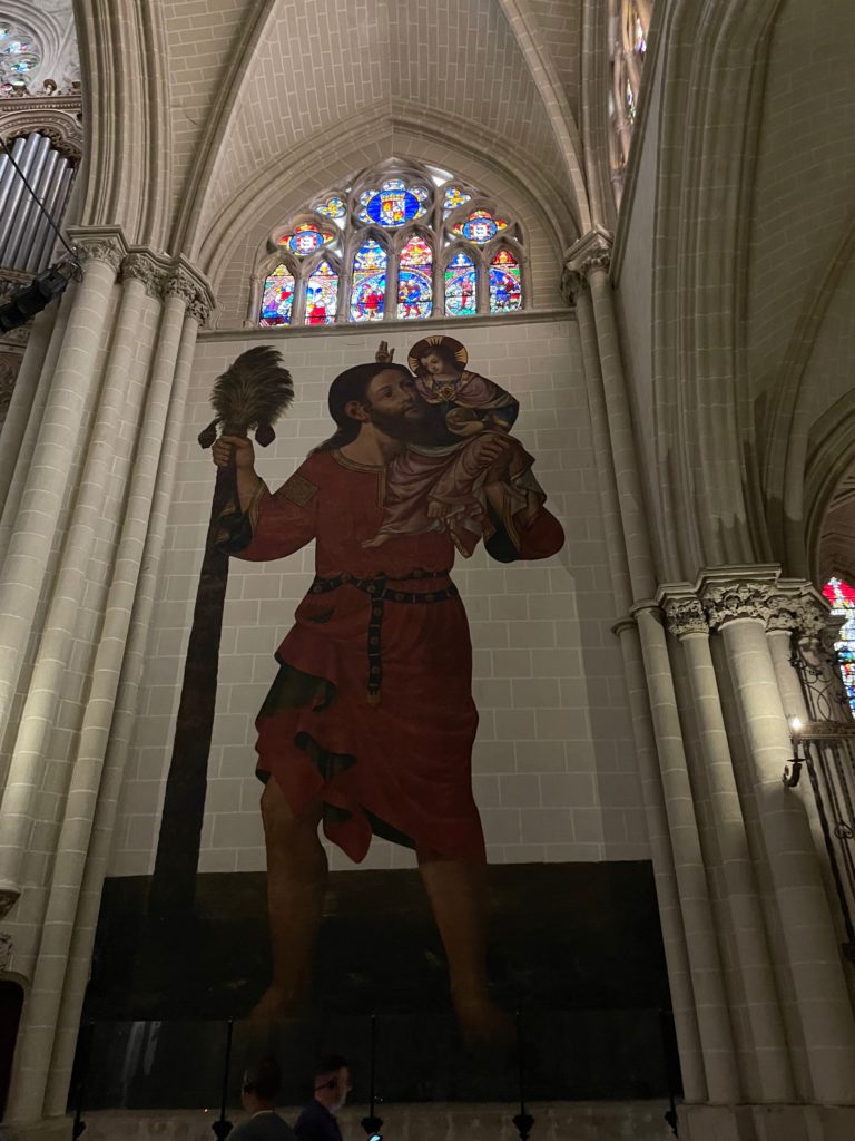
Wall painting of St. Christopher carrying the infant Christ, on the side of the transept entrance.

As we move forward from the side aisle of the nave to the side of the transept entrance, an unexpectedly large wall painting is shown of a bearded man carrying a child. The subject of the painting is also large within the settings of the painting; his “staff” is a palm tree. This is St. Christopher; legend has it that he carried the (miraculously heavy) infant Christ across a river, curing him of his pride and causing him to devote the rest of his life to Christianity.

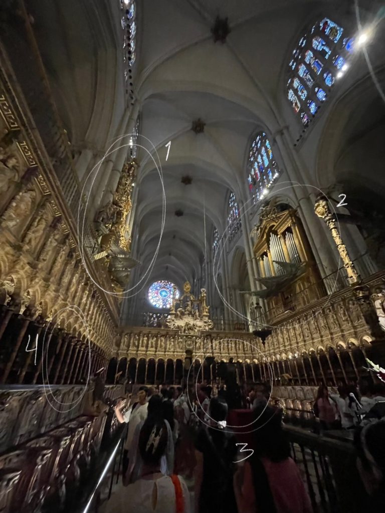
Choir of Toledo Cathedral.

Near the transept is the choir space, where the choir sings during services. The two gigantic organs are immediately visible, their pipes sticking out like cannons; the one on the left (1) is in the ornate Baroque style, while the one on the right (2) is in the more recent and austere Neoclassical style. The choir therefore already features a convergence of styles, blended smoothly so that all methods are encased in the overall “look” of the cathedral.

But how would the organ players get to the organs themselves, which are far above the rest of the choir? The answer lies in the back panels behind the columns; look closely at the panels behind the stairs, and you’ll see that they are in fact secret doors (4), which lead directly to the seats where the organists would play their hymnals.

The inner space is surrounded by three series of arches; this is where the choir sits, underneath the rows of statues of Biblical patriarchs and saints encased in individual niches. And of course, the gigantic lectern (3), where the conductor read from the gargantuan sheet music, is in the very center of the space itself. And make sure not to miss the statue of the Virgin Mary at the front of the gates, facing the apse and chancel.

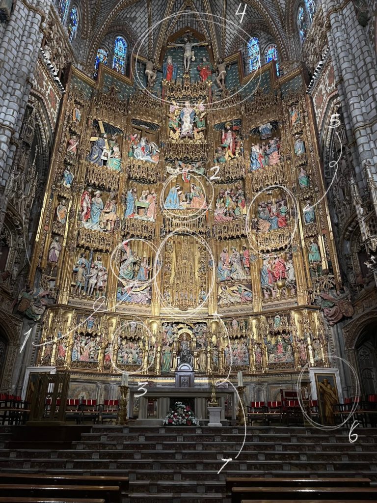
Altarpiece of Toledo Cathedral.

Behind iron bars, the chancel contains one of the most elaborate and dazzling altarpieces of any Gothic cathedral. Consisting of six golden tiers containing colorful scenes from the life and death of Jesus, this altarpiece is simply magnificent. Avid-eyed visitors can spot some iconic allegories and stories here; starting slightly left of center with the Annunciation (1), or the visitation of the angel Gabriel to the Virgin Mary; then moving to the top-center with the Nativity (2); then moving immediately to the Passion with the Last Supper (3) and Crucifixion (4). Finally, the story concludes with the continuation of the message of the Gospels, showing the Holy Spirit descending on the Apostles (5). Golden and polychromatic, this altarpiece is a beautiful triumph of medieval art—and consider also the fact that all of these sculptures are life-sized. Impressive indeed!

Take a close look at the painting in the bottom-right corner (6), and you’ll notice that it has hinges. That’s because it’s another secret doorway, which leads to none other than the center of the altar, the monstrance (7).

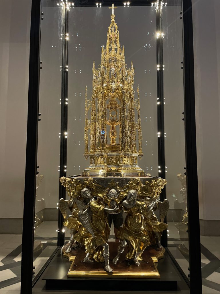
Of course, from way down below at ground level, the figures look miniature and the monstrance looks very small. But seeing the monstrance at eye level, we can see that it is, in fact, a gilt-silver tower. A closer look can be achieved by going to a separate room, where the original monstrance (the one in the altarpiece is a replica) is in a display case.

The monstrance of Toledo Cathedral.

Supported by angels and towering above, it truly looks like the giant achievement that it is.

But what is a monstrance? In short, it is the vessel in which the Eucharistic host (which is the sacramental bread you see in Communion services) is placed; in Toledo’s case, the host is placed within the (comparatively) tiny circular holder in the center of the monstrance. It truly can be called the centerpiece of the centerpiece.

El Transperente, towards the back of the apse.
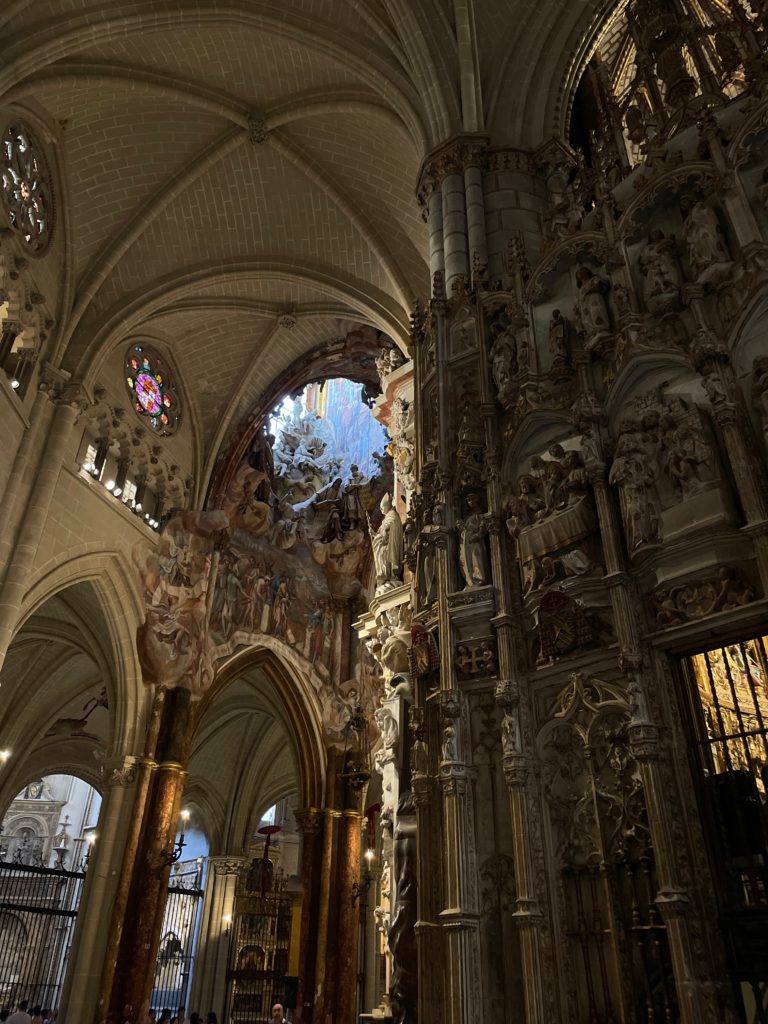
The hole in the ceiling illuminates El Transperente with natural light.

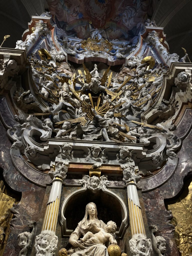
Moving on, the altarpiece behind the gilded wooden sculptures is equally as impressive. Known as El Transparente, this gigantic altarpiece is a true triumph, this time of the Baroque style. In a fantastic dreamscape cut from marble, angels and cherubim fly wildly through gilded shafts of light coming from the Eucharistic host, in a style perhaps influenced by Bernini’s famous Throne of Saint Peter in the Vatican, while the Virgin and child sit humbly at the bottom.

The golden rays emanate from none other than the previously mentioned monstrance, where the Eucharistic host sits as if the body of Christ itself radiates shining light. 

The real genius of El Transparente, however, lies in the way the sculptor designed natural light to hit the altar. In a dark cathedral such as this, especially in the very back of the church, where it’s hard for light to hit the altar, the illumination of the altar proves to be difficult. However, in a stroke of genius, the sculptor found the solution to lighting the piece by cutting a hole into the ceiling. This striking and unusual detail ends up working out very well: the light that hits this baroque masterpiece is completely natural. And, when the time of day and year are just right, the light is perfectly angled so that a single beam hits the Eucharistic host in the very center of the altar.

Annexes and cloisters

Towards the left of Toledo Cathedral, the entrance to the annexes are visible. Here, precious works of art by masters such as El Greco, Titian, Raphael, Caravaggio, and (in an unusually religious painting) Goya, are all on display. The most notable of these masterpieces, of course, is El Greco’s The Disrobing of Christ.

The Disrobing of Christ by El Greco, on display in the annex rooms.

Notice the striking (and at the time controversial) composition of the painting. Instead of Christ being at the very top of the painting, he is instead on the ground, surrounded by the people about to execute him. The drawn-out and elongated anatomy of the figures, especially visible in the man carving the cross and the figure of Jesus himself, is also very striking, especially as you get closer to the painting. Finally, the decision to only make Christ’s eyes glimmer white as he turns his face to heaven is deeply moving.

Before going to the cloisters, I would recommend taking some time to admire the other masterpieces that are on display in the annex rooms, which include Titian’s Portrait of Pope Paul III, Raphael’s The Virgin of the Veil, Caravaggio’s Saint John the Baptist, and Goya’s The Arrest of Christ, an unusual subject matter for the artist, as mentioned above.

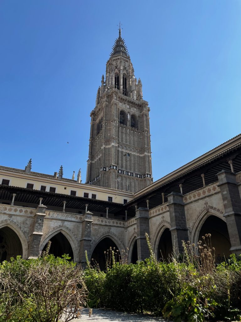
Concluding the visit to Toledo Cathedral, make sure to swing by the cloisters before you leave. Here, the herbal scent and cool shade of the arches make for a lovely atmosphere, and the view of the belfry isn’t bad, either. When we arrived, hardly any tourists were milling about the cloisters, so it makes for a nice place to rest for a minute if you don’t mind the suffocating heat.

View of Toledo Cathedral’s belfry from the cloisters.

Concluding thoughts

Toledo Cathedral is unquestionably a must-see for any visitors to the city. From its gorgeous exterior to its jaw-dropping interior, it speaks as a convergence of several different artistic and architectural styles. The influence left by the Moors, the Mozarabs, and the Spanish is carved indelibly in rock, the product of centuries worth of progress and innovation.

As a prime example of cultural synthesis, the cathedral really is an unquestionably unique and beautiful location. Where cultures collide, here beauty has sprung.

This article is based on our visit to Toledo Cathedral on June 23rd, 2023.