agonizing mysticism: pain, emotion, and comfort in the isenheim altarpiece

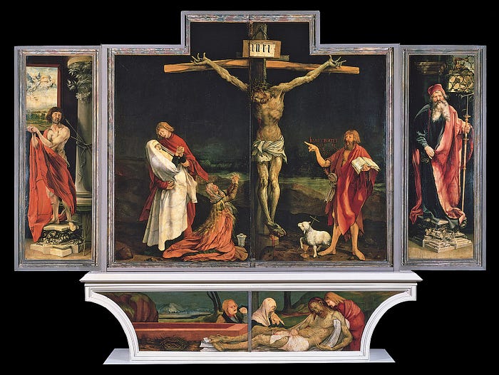
Matthias Grünewald, Isenheim Altarpiece, 1512–1516, oil and tempera on panel, Musée Unterlinden, Colmar, France.

A grotesque Man of Sorrows

A monstrously violent execution in the middle of the night: a thin, gaunt man, his skin a sickly gray-green and pockmarked with the scars of pox, hangs from a cross, his limbs contorted and hands outstretched in agony. Blood runs from his freshly pierced wounds, dripping down from his ribs and feet. His mouth wails silently in unimaginably painful death; the crown of thorns angrily juts into his skin like the splinters upon his body. His grieving disciples surround him; there is no peaceful, merciful death here, no ecstatic revelation. There is only the dark bleakness of suffering and death.

This is Matthias Grünewald’s monumental Isenheim Altarpiece, one of the most bleak and solemn, and simultaneously one of the most fantastic and magnificent, works of the North Renaissance tradition. A massive piece, measuring over 12 feet by 22, it functions as “essentially a box of statues covered by folding wings” (Hickson); three sets of wings of painted panel swing outwards to reveal Biblical scenes that ultimately lead to a polychrome wood ensemble of three seated saints, a multimedia type of altar popular in Germany at the time. (A video of the full altarpiece being opened can be seen here.)

This article will only analyze part of the Isenheim Altarpiece, which consists of six hinged wings, ten individual painted scenes, and sixteen polychrome wooden sculptures. Specifically, we will be looking at arguably the most intriguing—and disturbing—part of the altarpiece: the crucifixion scene, the very first motif the viewer sees when it is fully closed, as it usually was in its original setting. This violent depiction and its meaning go far beyond the mere vehicle of corporal suffering; rather, they both serve to emphasize the overarching meaning of the work itself, not one of despair, but one of comfort and hope.

A hospital for the dead

When analyzing any work of art, careful observation and consideration of its original setting and function are paramount to fully understanding the work. The Isenheim Altarpiece is no exception to this rule; indeed, a full grasp of its original context is vital to understanding Grünewald’s meaning completely.

This monumental work was originally “created to serve as the central object of devotion in an Isenheim hospital built by the Brothers of St. Anthony” (Hickson). Such altarpieces, serving as focal points serving as objects of devotion and hope, were not uncommon in European hospitals of the time, many of which were run by monastic orders such as the Hospital Brothers of St. Anthony.

We must note here that this hospital was not necessarily a place of healing and wellness; on the contrary, many patients here were probably beyond the point of saving and were at the point of succumbing to their illnesses. A better name for it would be hospice care, for that was what the monks of St. Anthony mostly attended to. This was not a place for actively getting better and recovering from sickness; rather, this was a place for comforting those who were about to pass away, treating them with care and compassion while offering them hope for a better life after this one.

As Professor Andrée Hayum notes:

“Present-day medical attitudes and treatments are primarily geared toward preservation of life… This situation is in sharp contrast to that of the early sixteenth century, when diseases quickly took on epidemic proportions… Hence the practice of medicine then was.. alleviating illness rather than restoring health” (Hayum).

This is especially true given the fact that many of the patients there suffered from ergotism, a deadly disease that came from consuming rye bread infected with fungus. It was also, incidentally, called St. Anthony’s Fire. The diagnosis was generally grim: patients could get painful seizures and convulsions, often leading to psychosis or mania, within hours of eating the contaminated food. Even worse, patients could become infected with gangrene, dying painful deaths of detached fingers and/or entire limbs. Ergotic patients would be stricken with characteristically pockmarked skin, which would cause painful scratching. The chances of survival were slim, especially after monks would often unwittingly feed patients infected bread.

Ergotism was a notoriously terrifying disease, claiming many thousands throughout the centuries of European history. Perhaps the most viscerally horrifying description of this disease comes from 11th-century monk Sigbert von Gembloux, who named 1089 the “Year of the Plague”, writing:

“That year there was an epidemic, where the Holy Fire consumed the innards of many people, who simply rotted away, because their limbs became black as coal and were eaten away. They either died in anguish, or their hands and feet fell off and they wasted away, living a painful life. Many people suffered, tormented by cramps, a real torture” (Stieglitz).

In a place of such grievous suffering and pain, the Isenheim Altarpiece stood as a central visual attractor in the space and the primary focal point of the patients. Its wings were closed most of the time, which meant that the patients would see the scenes of the crucifixion and deposition in the closed frontal state of the altarpiece most often. Only on specially designated feast days would the wings of the piece stretch open, revealing a vibrant and colorful interior.

The context of the Isenheim Altarpiece, then, was grim, painful, and tragic. Disease was a part of life in its original place; death was, of course, common. Keep this in mind as we begin to analyze the form and content of the work itself.

The marred crucifixion
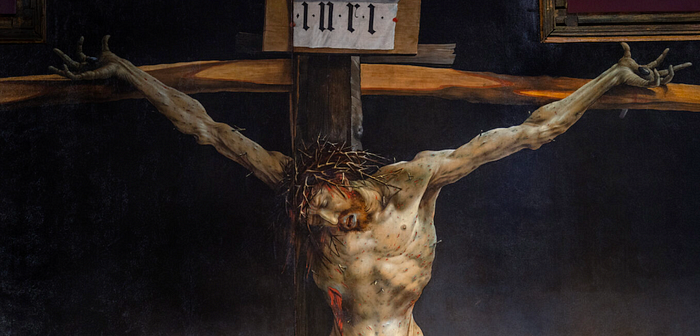
Matthias Grünewald, Isenheim Altarpiece (detail), 1512–1516, oil and tempera on panel, Musée Unterlinden, Colmar, France. Photo by Stephen Zucker, CC BY-NC-SA 2.0.

Like a twisted kind of visual magnet, the central theme of the crucifixion invariably draws our eyes toward the suffering, bloodied body of Christ. And how could such brutal visual agony not command our attention?

Indeed, the more one gazes at the central crucifixion panels, the more one feels disturbed, almost revolted, at the sheer scale of agony and suffering depicted so eloquently in the form of the crucified Christ. His limbs and hands stretch out and contort in obvious pain. The scarlet blood running from his stigmata contrasts so clearly with the pale skin of recent death, marred by splinters and—crucially—the characteristic pockmarks of ergotism.

This emphasis on connection with the ergotism of the patients of the hospital is further reflected in the body of Christ, which is depicted lying in the predella of the altarpiece. Christ’s corpse sprawls across the panels, bleeding and horrifyingly punctured. And, of course, the ergotic pockmarks are present here as well. The choosing of the two saints who flank the central panels, too, is no mere coincidence; Saint Sebastian was venerated as a patron of plague victims and a protector against bubonic plague (due to his body being marked with arrows), while Saint Anthony the Great was the namesake of the monks who cared for the sick here.
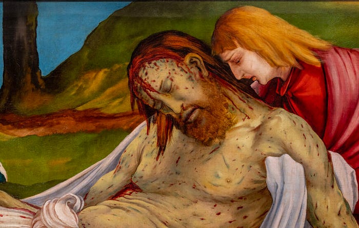
Matthias Grünewald, Isenheim Altarpiece (detail), 1512–1516, oil and tempera on panel, Musée Unterlinden, Colmar, France. Photo by Stephen Zucker, CC BY-NC-SA 2.0.

Several characteristics of Grünewald’s central panels are especially noteworthy. The lack of the halo in the forms of both Christ and the Mater Dolorosa, as well as in the forms of the flanking Saints Sebastian and Anthony the Great, speaks to the decline of the overt use of the “Byzantine” halo during the Renaissance. And, of course, the motif of the crucifixion with the Mater Dolorosa and the Agnus Dei is everything but new in the tradition of Western Christian art.

Many visual characteristics and nuances, however, stand out from this tradition. Consider the setting of the crucifixion; the sky is darkened (perhaps not a nighttime scene, but rather a nod to the eclipsing of the sun recorded in the account of the crucifixion within the Gospels), and the distant landscape undetailed, so that a black curtain seems to fall behind the action. John the Baptist, usually reserved for other artistic motifs, is included standing by the cross. And, of course, the form of Christ is contorted in pain; his suffering is dialed up to the point of near-grotesque abstraction.

The significance of pain is crucial to this work; as Professor Hayum writes,

“Pain is essentially a private experience that isolates its victim from his surroundings. In the open stage of the Isenheim Altarpiece… Grünewald seems to urge the viewer’s confrontation with this immediate reality, and he presents a circumscribed possibility for its alleviation” (Hayum).

Such artistic choices stand in stark contrast to the depictions of the crucifixion in different parts of Europe during the Renaissance, most specifically in the South (think Italian city-states here), where the humanistic emphasis was on mathematical perspective, realistic atmospheric landscapes, and stability. In Mantegna’s The Crucifixion, for instance, we find an entirely different scene from Grünewald’s panels, though the subject matter is the same. Mantegna’s Christ is almost pensive and restful, his halo glowing; Grünewald’s Christ is contorted in palpable agony and sans halo. Mantegna is interested in depicting atmospheric and mathematical perspectives; Grünewald’s background is almost pulled forward in its simplicity. Mantegna’s sky is blue and light; Grünewald’s is blackened and empty.
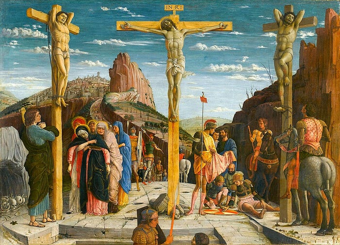
Andrea Mantegna, The Crucifixion, 1457–1459, tempera on panel, Musée du Louvre, Paris, France.

Such mathematical precision and clarity is, of course, a hallmark of the early Italian Renaissance, where the treatises of Alberti and Brunelleschi emphasized the depiction of humanism through such vehicles. Why, then, is Grünewald’s humanism so markedly different from the Southern tradition? Why is there such an emphasis on corporal suffering and pain?

The altarpiece as andachtsbild

Such humanistic emphasis on the mortal form of Christ, especially on his emotional and physical pain, was a crucial part of the vibrant tradition of Northern Gothic and Renaissance spiritual art.

This emphasizing of the grief and suffering of holy figures in art, intended to facilitate a viscerally emotional connection between an artwork and its viewer, is a major linchpin in the Northern tradition of andachtsbilder, or “devotional images” in German. Andachtsbilder hyperfocused on sorrow; the grief of Christ in the artistic motifs of the Ecce homo, the Arma Christi, or the Pensive Christ, as well as the grief of his companions and friends in the motifs of the Mater Dolorosa and the Pietà, would have resonated with the Medieval and Renaissance-era faithful, especially in an age where death and suffering were not uncommon.

This relatively new tradition was a clear breakaway from the Medieval depictions of Christ when the Son of God was depicted as triumphant and simultaneously separated from the viewer. Artistic motifs such as the Christus triumphans and the common subject matter of the Last Judgement (especially popular in the tympana of cathedrals) emphasized the divinity of Christ, his holiness, and his lasting victory over sin and death. In Medieval works such as these, Christ’s face is one of transcendence and triumph.
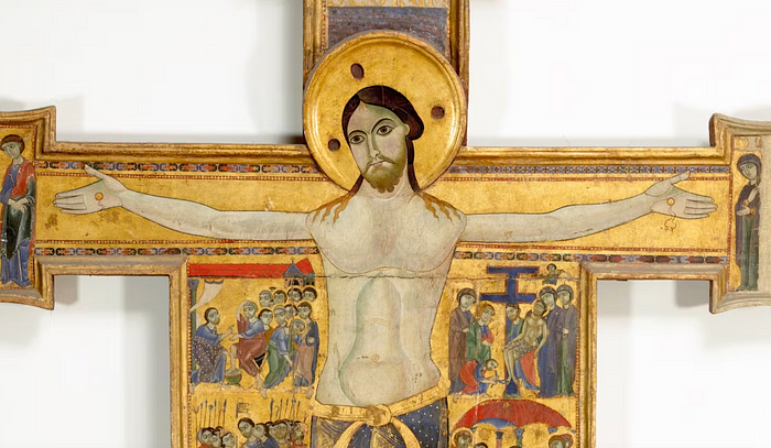
Unknown Pisan painter, Cross no. 432 (detail), 12th century, tempera on wood, gold background, Gallerie degli Uffizi, Florence, Italy.

This perspective of Christ as distant and victorious, however, started to shift in the early 13th century as part of a broader religious movement, which began to emphasize the humanity and sufferings of Christ, rather than his divine conquering, to pave an emotional connection between God and the common suffering of the average person. Starting from this time, influential writers such as Bonaventure and Meister Eckhart began to stress the humanity of Christ, and religious groups such as the Franciscans, the Beghards, and the Gottesfreunde followed. Indeed, as Dr. Nancy Ross says,

“Late medieval devotional writing… leaned toward mysticism and many of these writers had visions of Christ’s suffering. Francis of Assisi stressed Christ’s humanity and poverty. Several writers, such as St. Bonaventure, St. Bridget of Sweden, and St. Bernardino of Siena, imagined Mary’s thoughts as she held her dead son. It wasn’t long before artists began to visualize these new devotional trends” (Ross).

This vibrant and, from a modern point of view (one that has become admittedly tainted with a stereotypical perspective of the Middle Ages as a period of backwardness and fervently divine thought), surprisingly humanistic tradition extended throughout the 13th century and beyond with Thomas à Kempis’s The Imitation of Christ and the movement of the Devotio Moderna. Such theology had a humanistic bent to its core tenets and principles, emphasizing the spiritual connection between the divine and the mortal. These connections were made especially frequently through the use of compassion in pain; depictions of Christ and his followers in deep grief and emotional agony, although horrifically violent, were intended “to show that God and Mary, divine figures, were sympathetic to human suffering, and to the pain, and loss experienced by medieval viewers” (Ross).
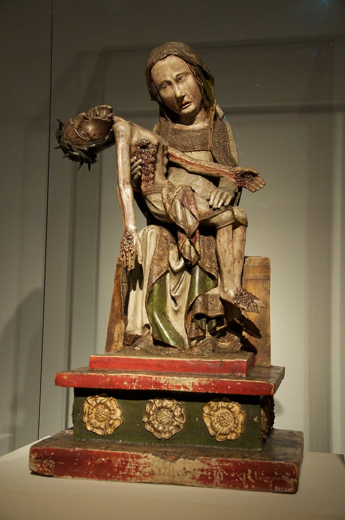
Unknown artist, Röttgen Pietà, 1300–1325, polychrome wood, Rheinisches Landesmuseum Bonn, Bonn, Germany.

An earlier artwork, similarly from the German andachtsbilder tradition, which we can compare to the Isenheim Altarpiece is the Röttgen Pietà. Here, the subject matter is a little different—the solitary Virgin Mary cradles the dead Christ after the Deposition—but the principal function of its form is remarkably similar. The Pietà, which would have been placed in a small chapel, aimed to elicit a similar emotional response and connection to the suffering of Christ. Similarly to the Isenheim Altarpiece, Christ’s wounds and form are exaggerated in their horrifying violence (his head bends backward at an unnatural angle, blood runs from his glaring stigmata, and his body and limbs are distorted to the point of near-abstractionism); the factor of physical pain is run to its absolute limit.

Emotional pain is dialed up as well. The face of the Virgin Mary is especially notable; holding her son’s body in her hands, her face is not one of quiet, accepting sadness or pensive tranquility (as is the case in Michelangelo’s rather more famous treatment of the same subject). Rather, she “appears to be angry and confused… She shows strong negative emotions that emphasize her humanity, just as the representation of Christ emphasizes his” (Ross).

Andachtsbilder such as these were meant to give a specific message, a specific kind of comfort and compassion, to their viewers. Medieval viewers, by seeing such gruesome pain experienced by even the divine, were meant to feel a closer, more personal connection to God, deeply intertwined with the emotional and the painful. “God sees and feels your pain,” the works say; “He suffered just as you did in life.”

Despair and triumph

Despite the emotional connection forged between the divine and the viewer through such themes of agony and suffering, though, the Isenheim Altarpiece is not entirely grounded on bodily pain. In fact, when the altarpiece was opened on special feast days, the viewers would have been greeted with a stunningly beautiful depiction of triumph over death, resurrection, and hope, a far cry from the subject matter of the front panels.
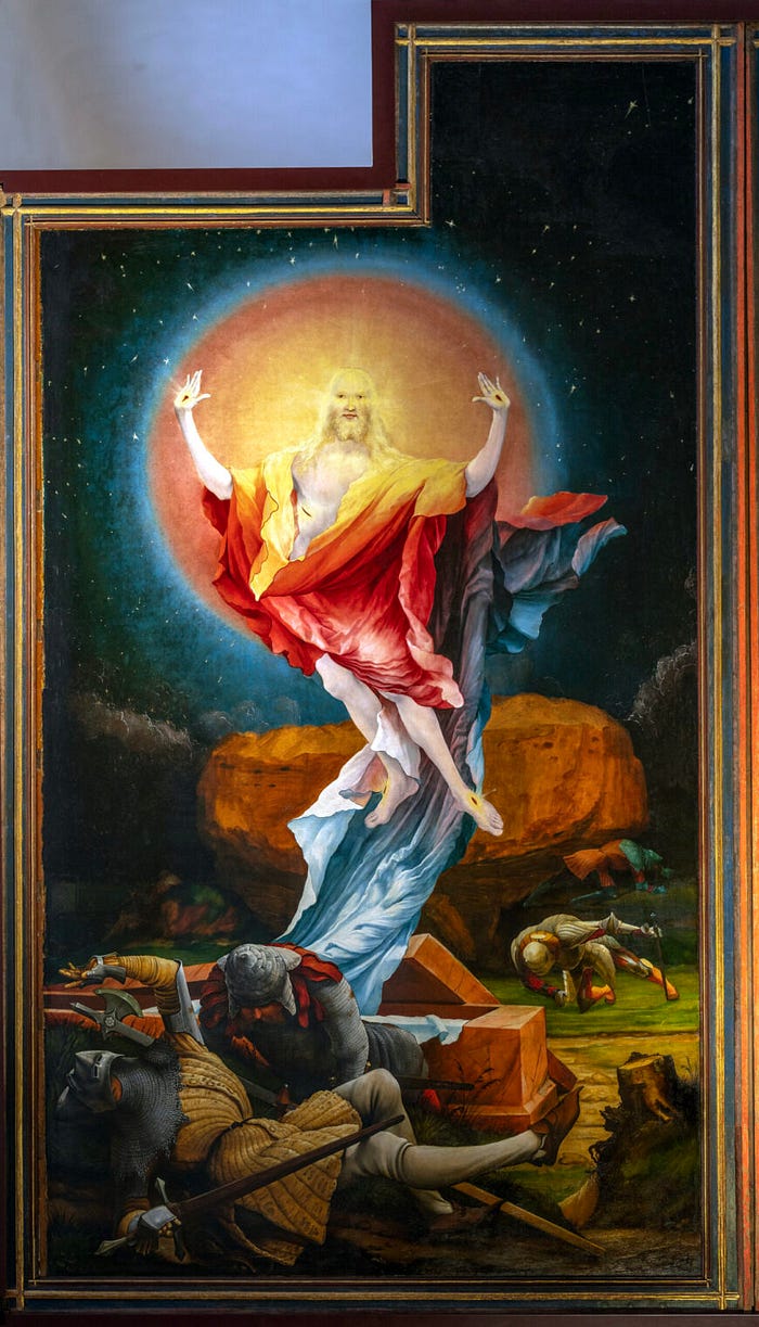
Matthias Grünewald, Isenheim Altarpiece (detail), 1512–1516, oil and tempera on panel, Musée Unterlinden, Colmar, France. Photo by Stephen Zucker, CC BY-NC-SA 2.0.

The inside panels depict what is essentially a speedrun through the life of Christ, depicting, from left to right, the Annunciation, the Nativity (angelic choir included), and a combination of Transfiguration, Resurrection, and Ascension.

This rightmost panel is especially fascinating and is described as “the strangest of these inner visions” (Hickson). Christ rises from the tomb and over the sleeping soldiers, wrapped in a brilliant cloak of bright yellows, oranges, reds, and blues. A shining body halo painted in sunset colors surrounds him, and his face, radiating with divine light, is so bright that it almost blends in with the halo behind his head. The scene is again during the night, but the subject matter is not death, but rather the triumph over death itself.

Christ’s body is again the center of our attention, but his body is perfect and otherworldly, unmarred by the scars of ergotism or pox. The wounds of his physical suffering, the stigmata, are transformed with a golden glow into a symbol of transcendence and triumph. His face is not contorted in pain, but tranquil in everlasting peace. This is a vibrant and physically moving depiction of Christ resurrected, of the divine victory over suffering and death. It certainly would have moved the patients of the Isenheim hospital, offering the hope of transcendence and peace to those afflicted with disease.

Grünewald has clear control of both the depiction of intense agony—both physical and emotional—and that of peaceful ascendancy. The Isenheim Altarpiece is simultaneously a praise of divine suffering, a sympathetic depiction of agony, and a prayer for hope after death. It is, in other words, a unique visual thesis on the nature of pain, faith, death, and resurrection.

Sources cited

Hickson, Sally. “Matthias Grünewald, Isenheim Altarpiece.” Smarthistory, 27 April 2023, https://smarthistory.org/grunewald-isenheim-altarpiece/.

Ross, Nancy. “Röttgen Pietà.” Smarthistory, 8 August 2015, https://smarthistory.org/roettgen-pieta/.

Hayum, Andrée. “The Meaning and Function of the Isenheim Altarpiece: The Hospital Context Revisited.” The Art Bulletin, December 1977, https://www.jstor.org/stable/3049705.

Stieglitz, Ann. “The Reproduction of Agony: Toward a Reception-History of Grünewald’s Isenheim Altar after the First World War.” Oxford Art Journal, 1989, https://www.jstor.org/stable/1360358?seq=5.

“The Isenheim Altarpiece animation.” YouTube, uploaded by Smarthistory, 18 April 2023, https://www.youtube.com/watch?v=HoXwnbYR8Fk.
masterpieces, skipped: notes from the louvre collection

The following article is from our family’s travel blog, arttravel.me. It was written by me.
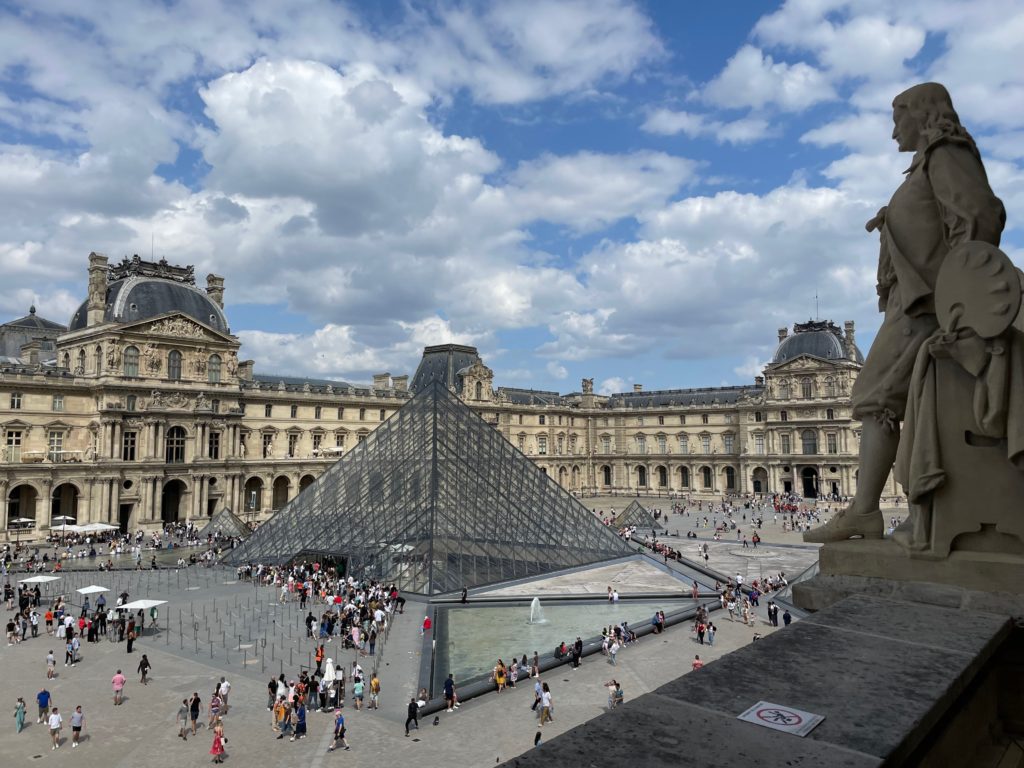
Plaza del Louvre, seen from the second floor of the Denon wing.

Introduction

Of all the art museums, the Louvre is unquestionably the most prestigious. The name alone commands the power of its history, its reputation, and its massive collection of over 380,000 works of art. It draws millions of tourists to its galleries every year, and with such quintessential works of art like the Mona Lisa, the Venus de Milo, and Liberty Leading the People, who can blame them?

However, a problem arises precisely from the fact that the Louvre houses so many famous artworks. Because of their fame, too many tourists often visit the Louvre solely for these few masterpieces, leaving many more outright ignored. Which, of course, is a travesty. Fame isn’t a great way to appreciate any artwork, and in a place such as the Louvre, with so many beautiful pieces, the somewhat superficial standard of how famous a painting hinders the true experience of understanding and admiring any artwork.
Sadly, I was one of those tourists who judge by reputation alone when I visited the Louvre for the first time, back in 2018. As I found on this visit, the feeling of satisfaction at having seen something famous is nothing compared to the elation and peace that comes when you stop and really admire a beautiful piece. Prestige from fame just doesn’t compare.
So, armed with a (hopefully) deeper knowledge of art history, as well as a renewed standard of viewing art, I have compiled a list of underappreciated masterpieces from the Louvre collection. “Underappreciated” here is a vague term; the pieces shown below attracted barely any tourists when I visited, and attracted virtually no crowds at all. They all possessed a quiet beauty, a beauty that is, when properly appreciated, an unparalleled experience.

Without further ado, let’s begin our journey. The following is a list of the 10 artworks we’ll be examining, all tragically ignored:

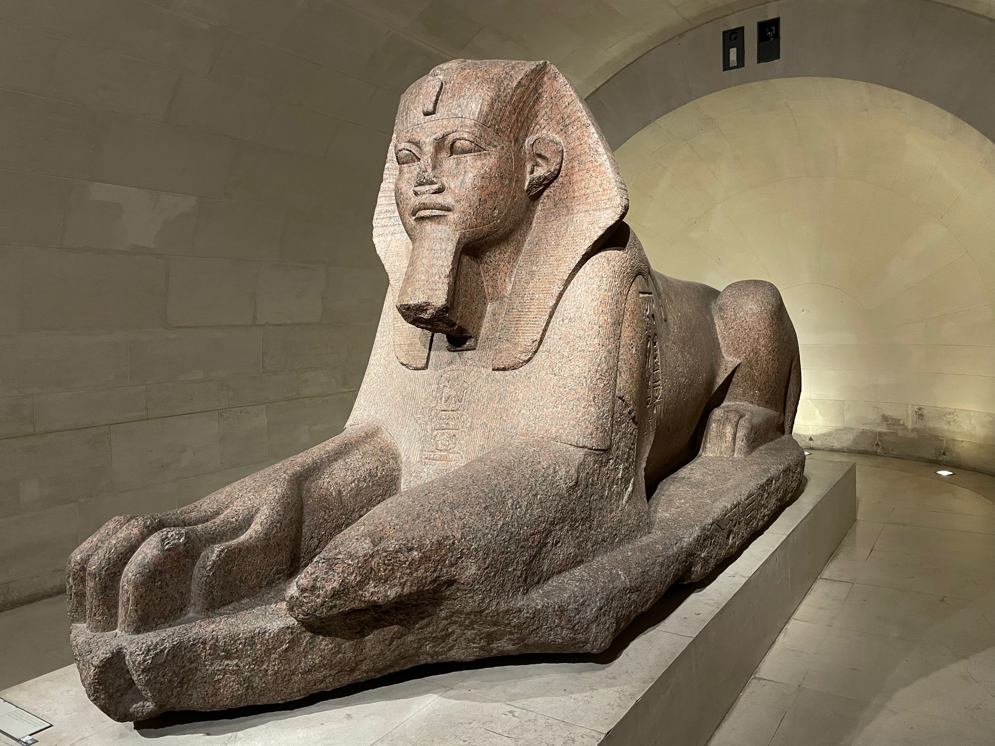
  • The Great Sphinx of Tanis. 26th century B.C.(?), granite.
  • The Boy Strangling the Goose. Boëthus, 2nd century B.C., marble (Roman copy).
  • Saint Francis Receiving the Stigmata. Giotto, 1295-1300, tempera and gold on panel.
  • The Counterattack of Michelotto da Cotignola at the Battle of San Romano. Paolo Uccello, 1435-1460, tempera with oil on wood.
  • La Belle Jardinière. Raphael, 1507-1508, oil on panel.
  • The Wedding at Cana. Paolo Veronese, 1562-1563, oil on canvas.
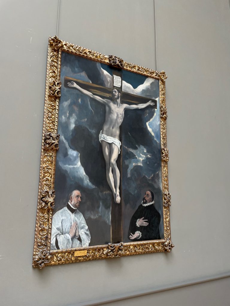
  • Christ on the Cross Adored by Two Donors. El Greco, 1590, oil on canvas.
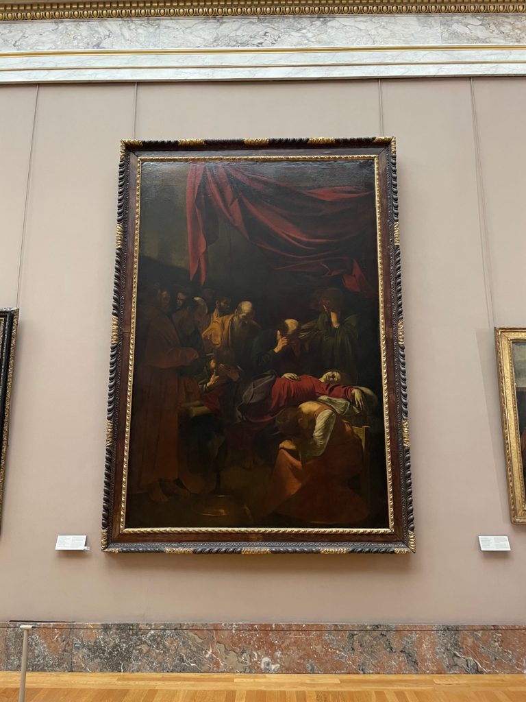
  • Death of the Virgin. Caravaggio, 1604-1606, oil on canvas.
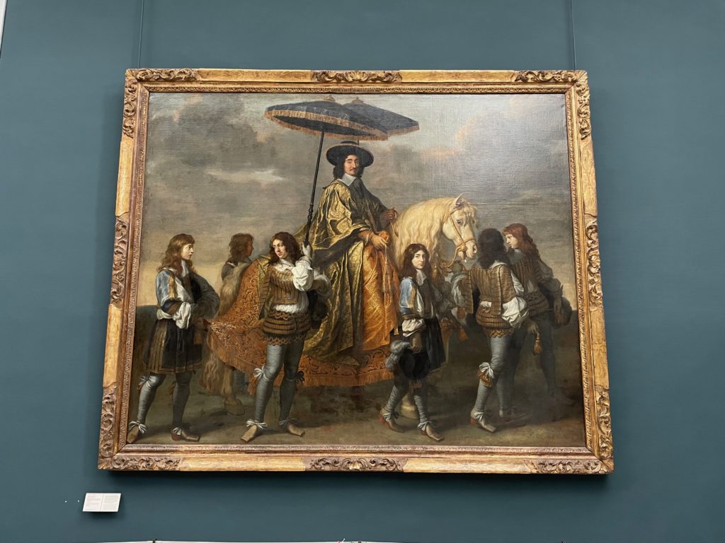
  • The Chancellor Séguier. Charles le Brun, 1660, oil on canvas.
  • The Astronomer. Johannes Vermeer, 1668, oil on canvas.

Let’s start with the very oldest work on our list: the Great Sphinx of Tanis.

The Great Sphinx of Tanis

26th century B.C.(?), granite

Most visitors to the Louvre skim through the antiquities section on their way to see the famous Renaissance collection. They’ll probably take pictures of two marble statues: the Venus de Milo and the Winged Victory of Samothrace.

This is a shame because the Louvre’s collection of Near Eastern and Egyptian antiquities is outstanding. One of the gems in the Egyptian collection is the Great Sphinx of Tanis. Sculpted from pinkish granite, it is in excellent condition considering its age. The sculpture is believed to have been made in the 26th century B.C. That’s over four thousand years ago!

The statue is also remarkable in the message it conveys. The sphinx sits upright and proud; its paws are disproportionately huge, radiating raw power; and is that a Shelleyan smile of pridefulness on its lip? One thing’s for sure: this sphinx is designed to convey dignity and might. Four thousand years later, it still fulfills its goal.

And while you’re in the Egyptian antiquities section, make sure to check out the ancient papyrus manuscripts, which are exquisitely decorated with reed-pen ink, as well as the collection of carved sarcophagi.

The Boy Strangling the Goose

Boëthus, 2nd century B.C., Roman marble copy

Despite the morbid title, the subject of this statue is actually somewhat of a mystery. Is the boy playing with the goose, hugging it affectionately to the chagrin of the bird? Or is he twisting its neck in a scene of jarring violence? The statue doesn’t say, and the enigma continues (though most modern sources refer to it as The Boy Strangling the Goose).

Notice the vivid sense of movement found in this sculpture. The flap of the indignant goose’s wings and the backward lean of the boy both convey motion as if it is a snapshot of a moment. And the chubby belly and limbs of the boy are accurately sculpted to show the features of a small child, as are the feathers of the goose.

Whether it’s a playful or deadly scene, we cannot deny that The Boy Strangling the Goose eloquently expresses motion in stone, seemingly effortlessly capturing a second like a fly in amber. The skill and beauty both show in the carved marble.

Saint Francis Receiving the Stigmata

Giotto, 1295-1300, tempera and gold on panel

Medieval art has somewhat of a reputation. Most people just aren’t fans of the flat figures, the lack of perspective, and the (admittedly) ugly depictions of the subjects. As a result, many visitors end up skimming over or totally skipping most of the medieval collections in favor of getting to the Renaissance artworks quicker.

However, I believe that medieval art has its own merit and charm. Two paintings demonstrate this; the first is Giotto’s Saint Francis Receiving the Stigmata. Depicting the story of Saint Francis receiving Christ’s wounds in a mystical experience, the gold background and halo combine with the delicately brushed tempera paint to form a scene with its own kind of 2-D beauty.

Giotto also portrayed the emotions of his subjects vividly, in a radical break from the Byzantine iconography of the time. This is just one of the factors that ultimately led to the development of the Renaissance and its humanistic art.

The Counterattack of Michelotto da Cotignola at the Battle of San Romano

Paolo Uccello, 1435-1460, tempera with oil on wood

The second artwork I mentioned is the lengthily titled The Counterattack of Michelotto da Cotignola at the Battle of San Romano, a segment of the overall Battle of San Romano series by Paolo Uccello. It is one-third of the total series.

This painting is revolutionary because of its previously unheard-of use of perspective. While previous artists did use the technique previously, Giotto specifically used it not to improve the narrative or theme of the painting, but rather to improve the realism of the scene—that is, for the sake of depicting depth realistically. According to Uccello’s biography written by Giorgio Vasari in his Lives, Uccello was deeply obsessed with perspective and vanishing points, often poring over a scene for hours into the night to analyze its perspective.

This kind of usage of techniques such as perspective for the sole purpose of making the painting more realistic was pioneered by Uccello. It would later become a hallmark of the Renaissance, and eventually, the Western canon.

La Belle Jardinière

Raphael, 1507-1508, oil on panel

We enter into the Renaissance at the turn of the 16th century, with one of the great Italian masters, Raphael. Of his many works in the collection of the Louvre, my personal favorite is Madonna and Child with Saint John the Baptist, also known as La Belle Jardinière.

The painting has all the hallmarks of a Raphaelesque Renaissance work: the triangular arrangement of the figures, the perfect-looking skin and faces, and the bright fabrics are all undeniably Raphael. This particular subject was not strange to him, either; he had already painted a separate Madonna painting (Madonna of the Goldfinch, Galleria Uffizi), and would go on to paint several more throughout his career.

The painting is strikingly tender and emotional. The Virgin Mary’s loving gaze towards the infant Christ, with Saint John the Baptist looking at Christ as a sort of witness to this bond, creates a format composed of three lines of gazes: Mary to Christ, Christ to Mary, and John to Christ. The tenderness of the painting makes this unique in the Raphael collection.

The Wedding at Cana

Paolo Veronese, 1562-1563, oil on canvas

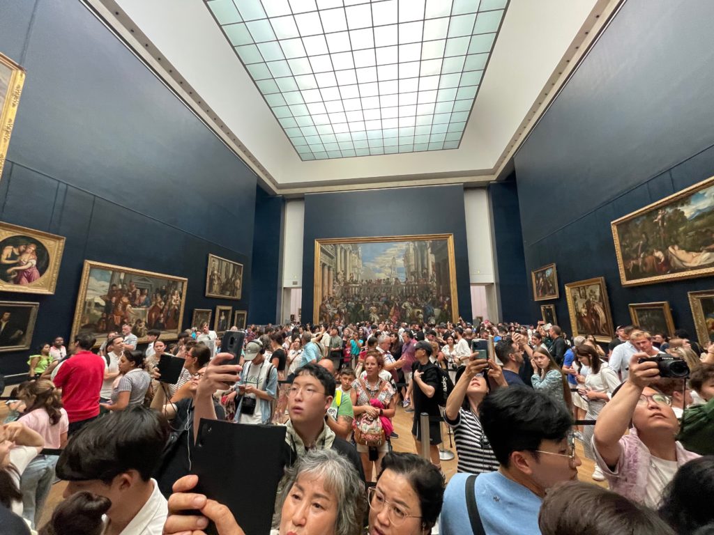
As the picture above shows, the most crowded room in the entirety of the Louvre is the one where the Mona Lisa is housed; it was behind me when I took this picture. But da Vinci, although he was undoubtedly an artistic genius, didn’t paint the only masterpiece in the room. One only has to look to the opposite wall to see another beautiful artwork, much larger than (and more ignored than) the Mona Lisa by far: Veronese’s The Wedding at Cana.

This giant canvas depicts the Biblical story of the wedding feast at Cana in almost life-size; the style is clearly based on the Venetian school, of which Veronese was a clear master. The artist’s attention to detail shows; the individual faces of every single attendant, apostle, and attendee are painted clearly, their faces showing their emotions in subtle shades.

Of course, bigger doesn’t mean better when it comes to paintings. But when it comes to Veronese, his canvas is both bigger and better than most of the competition.

Christ on the Cross Adored by Two Donors

El Greco, 1590, oil on canvas

From the Italian Renaissance, we move on next to the Baroque and Mannerist movements of the Counter-Reformation. And with El Greco being the poster boy of the Mannerist school of art, the Louvre is bound to have a few paintings by him.

The title, of course, is ironic: even though the two donors specifically paid for the painting with their faces in it, we have no record of who they actually were. Rather, our attentions are drawn immediately to the twisted and tormented figure of Christ on the cross, dramatically lit in the theatrical Baroque style. Also notable are the clouds in the background, built like great arches in the sky.

The theatricality of El Greco’s composition is a hallmark of the Mannerist and Baroque schools. Another example of this intentionally dramatic composition can be found in our next painting.

Death of the Virgin

Caravaggio, 1604-1606, oil on canvas

As El Greco is considered a master of Mannerism, so too is Caravaggio considered a master of the Baroque.

When the Counter-Reformation in the arts was in full swing after the Council of Trent, Caravaggio’s art was in high demand as beautifully demonstrating the theatrical, dramatic lighting of the Baroque style. This dramatic lighting is exemplified in Death of the Virgin: it is as if a spotlight has been pointed at the pallid face, which is thrown into sharp contrast with the shadowed, mourning faces of the apostles.

Something interesting to note: the death of the Virgin Mary is a somewhat common motif in Catholic art, and many artists had chosen this before Caravaggio. In their paintings, the Virgin ascends into heaven still alive, crowned in the glory and majesty of heaven; but in Caravaggio’s painting, the Virgin just looks… dead. This seemingly irreverent take, though, is what elevates this work beyond the clichéd and into the poignantly emotional.

Another interesting thing to note is Caravaggio’s choice to use models from real life as the models for the sacred people in his scenes, including those from lower social strata. When this painting was originally unveiled, it caused quite a stir, as Caravaggio had used the face of a prostitute to model for his Virgin Mary. Perhaps it is this touch of the common, combined with the lighting of the theater, that gives his works a timeless and deeply emotional quality.

The Chancellor Séguier

Charles le Brun, 1660, oil on canvas

In the late 17th century, France was an exceptionally powerful kingdom in its heyday. Under the rule of Louis XIV (whose nickname was “the Sun King” and once said that “I am the state”, showing us his very humble nature), France prospered and, as a result, started to increasingly fund artists more and more.

In his painting of the Chancellor Séguier, Charles le Brun aptly shows the prosperity—almost ranging on decadence—of Louis XVI’s France. The eponymous chancellor sits regally on a pale horse, wearing a fine hat and flowing gold robes; attendants shade him with a parasol and lead the horse. And consider the fact that this was to celebrate the King entering Paris in 1660! One can even draw parallels between our first Great Sphinx of Tanis and the portrayal of royal magnificence. Both convey a central theme: power.

As the painter of the Sun King in all his glory, Charles le Brun demonstrated both technical skill and the ability to communicate themes in deceptively simple-looking works. Even now, his themes still resonate with us.

The Astronomer

Johannes Vermeer, 1668, oil on canvas

We finish off our tour of the underappreciated works of the Louvre with a painting whose quiet solitude especially saddened me, especially since it was executed by one of my favorite artists: Johannes Vermeer’s The Astronomer.

As I have written previously in another blog post, Vermeer was ridiculously good at photorealistic depictions of light and tone in his snapshots of ordinary moments. In fact, some scholars today argue that he executed his paintings with the aid of a kind of camera obscura—he was that good. He only ever painted around 40 works in his entire career; all are considered masterpieces today.

Of these works, The Astronomer has somewhat of a wild history. Ranking at the very top of the Nazi regime’s most wanted list of artworks, it was looted by Herman Göring during the Second World War. Thankfully, it was returned undamaged and now sits quietly in the second floor of the Louvre’s Richelieu wing.

As with many of Vermeer’s other works, the atmosphere comes primarily from light and solitude. The light doesn’t illuminate only the astronomer; it fills the whole room naturally, the way you would expect on a warm afternoon. The astronomer’s solitude, highlighted by the motion of reaching for the celestial globe, only accentuates and increases the effect of this natural light. The nickname “painter of light” goes often to Thomas Kinkade, but I think the title would be far more suitable for Johannes Vermeer.

Conclusion

Too often, people rush to and admire paintings and artworks based only on their provenance and fame. I believe this is a flawed and ultimately unsatisfactory way of looking at art, and I hope this article helps illustrate that. Just because it’s not a Leonardo da Vinci doesn’t mean it’s not a masterpiece.

milan’s marble face: notes on the duomo

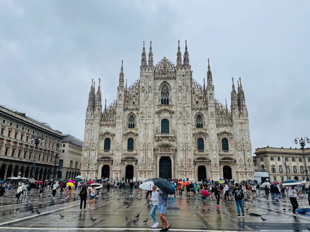
The Milan Duomo, seen from the Piazza del Duomo.

Over 8 million tourists visited Milan in the year 2019; the number is projected to increase amidst a pan-European tourism boom. What did they come to see? Certainly, the northern Italian city has many attractions that appeal to a great number of sightseers, including Leonardo da Vinci’s The Last Supper, the historic Teatro alla Scala, and the beautiful Sforzesco Castle. But there’s one place that almost all of these tourists will certainly see: Milan’s cathedral, the Duomo.

And no wonder: the Duomo took over 600 years to build. To put that in another way, the amount of time it took to build the Duomo is more than the amount of time the Roman Empire (going by the time of the fall of the Western Roman Empire, 476 AD) existed. The cathedral is no joke.

But of course, the length of construction time isn’t the only way to measure a building’s worth. So what makes the Duomo special? This is the question we sought to answer when we visited the cathedral and one that we held in our heads for most of our visit. Just what is it about the Duomo that makes it so irresistible?

Exterior

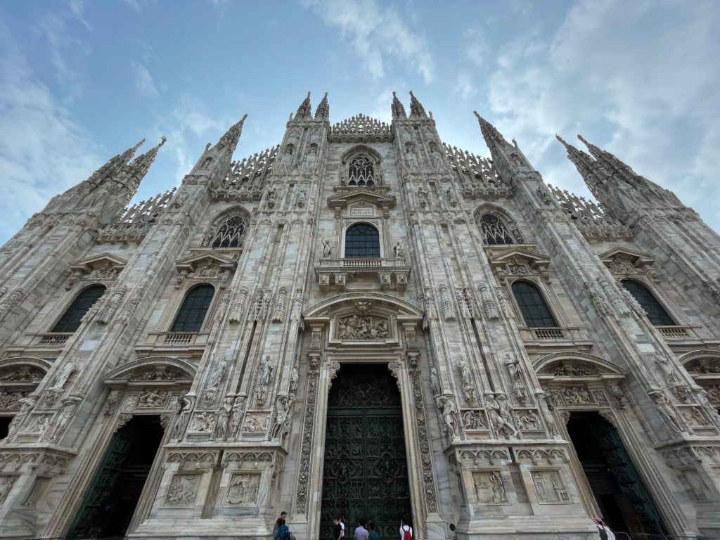
The Duomo’s façade from close up.

Visiting the cathedral, the first thing that immediately caught our attention was, obviously, the front façade. Built completely of white marble, it is a masterpiece of Gothic architecture and design. Note the flat, pyramidal composition of the façade, its richly carved spires culminating at the apex and combining with the main body to form a visually pleasing pentagonal shape. Intricately decorated “head to toe” with carved marble figures and columns, the front face of the Duomo is probably one of the most beautiful parts of the entire cathedral.

Before we even stepped foot into the cathedral proper, one of the biggest reasons for the Duomo’s popularity showed itself to us: its sheer size. Counting by square area and volume, the Duomo is the third-largest church building in the world. The façade shows this quite bluntly; the flatness of the marble face makes for a focal point visible from anywhere in the Piazza del Duomo. Seeing the whole building clearly requires a view from the center of the Piazza itself. Otherwise, the building just doesn’t fit into the range of the eye.

This factor of fame, size, was soon to become much clearer in the interior of the Duomo.

Interior

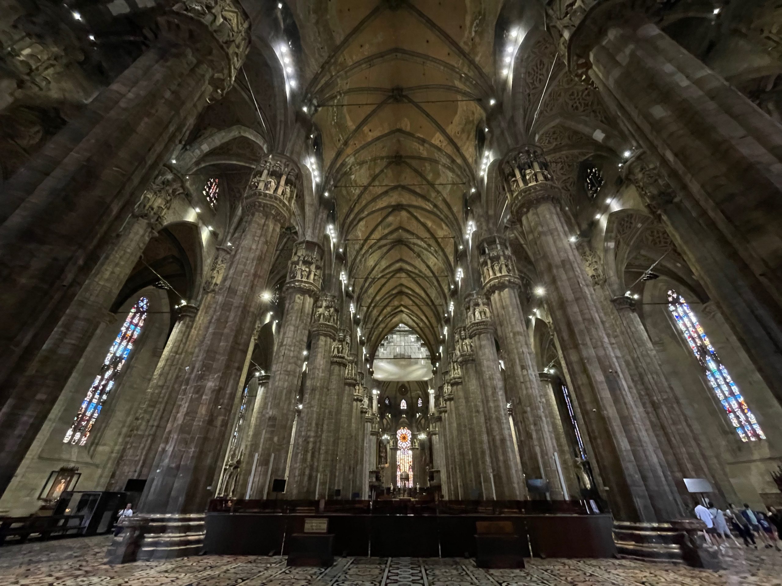
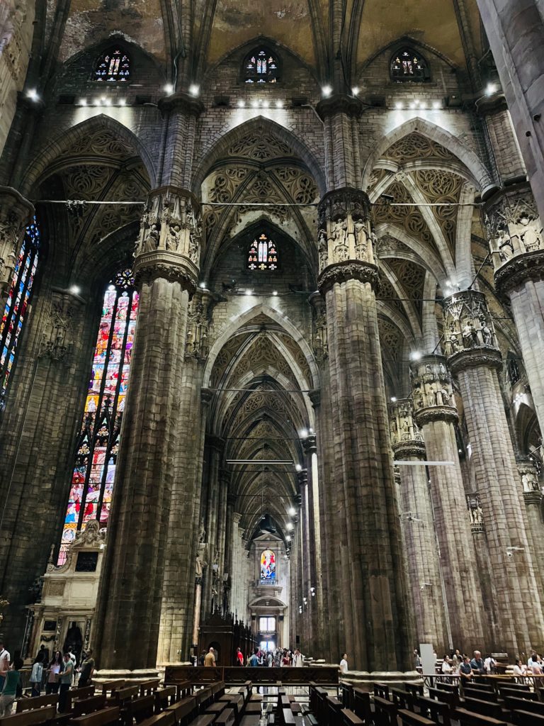
Duomo, central nave.
Alternate view of the naves, seen from the transept.

Entering through the front of the cathedral, we were immediately overwhelmed by the sheer volume of the space. Gigantic stone pillars stretched almost impossibly high, supporting a rib-vault ceiling and spreading the weight of the roof along the five naves. The size of the human figures next to the columns in the bottom picture gives a vague sense of perspective to the viewer. It’s hard to imagine just how much space the cathedral takes up until you actually go inside.

From the sheer size of the columns, taller and thicker than trees, we can get a grip on the challenge of simply holding the roof up, much less keeping the walls standing, sculpting the hundreds of intricate details, and maintaining such a vast space. The very existence of a building as vast as this, factoring in construction time, restoration, and maintenance, is truly remarkable.

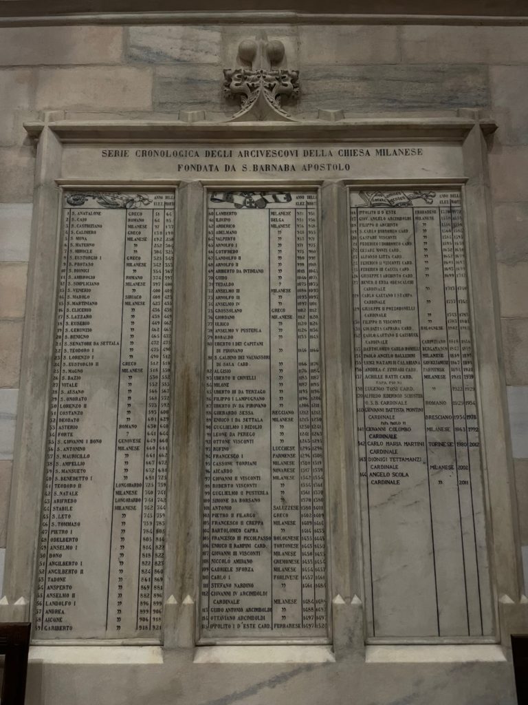
List of Milan’s archbishops. The Duomo’s first archbishop was Antonio da Saluzzo (listed as “Antonio Saluzzese”), number 101 on the list.

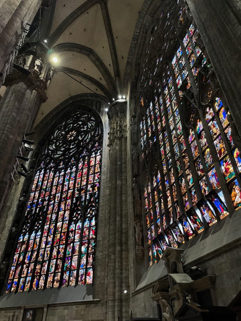
Walking down the nave towards the apse, we were encountered by gigantic stained-glass windows and a large number of side altars. One of the most incredible testaments to the sheer length of time it took to build the Duomo is towards the right of the nave; a marble panel on the wall lists all the archbishops of the city of Milan, ever. The archbishops of the present-day cathedral start around halfway down. It really speaks to the age of Milan’s Christian community, and to the age of the Duomo.

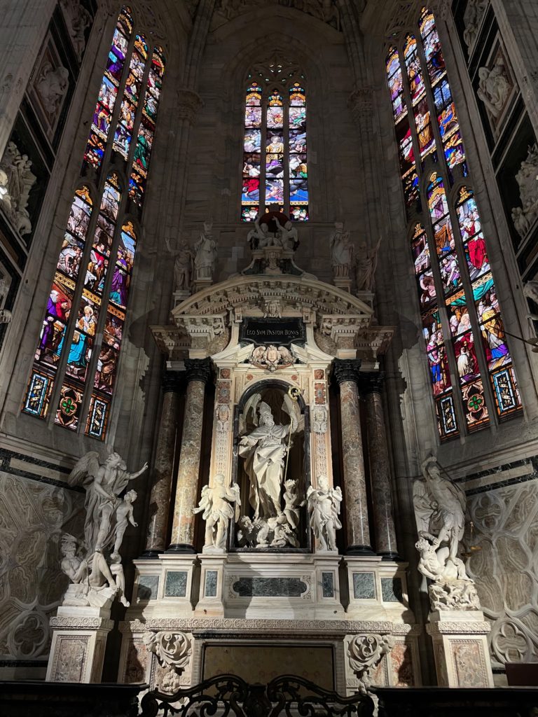
Side chapel in the Duomo.

For me, the most beautiful side chapel was the one pictured above, with what looks to be a statue of Saint Ambrose encased in a wonderfully baroque sculpture. The placard above him, “Ego sum pastor bonus”, is a quotation from the Bible, and is Latin for “I am the good shepherd”. Surrounded by beautiful stained-glass windows, this chapel is right next to the exit from the roof terraces, and I’d recommend stopping to admire it for a moment or two.

These kinds of side chapels are scattered across the sides of the cathedral, specifically next to the rightmost and leftmost naves. Their styles range from the Medieval to the Baroque, similar to Toledo Cathedral. Often, they include statues carved of marble and stone.

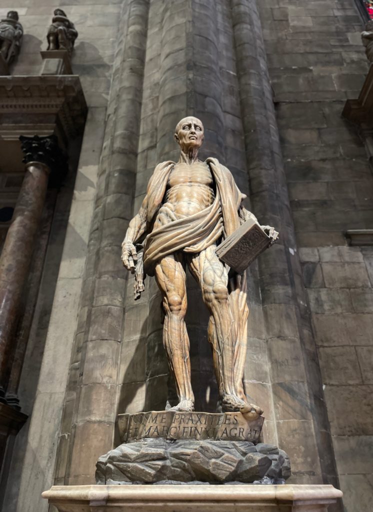
St. Bartholomew Skinned, by Marco d’Agrate.

Of course, one of the most famous sculptures in the Duomo is Marco d’Agrate’s “St. Bartholomew Skinned”. The stone statue features the eponymous St. Bartholomew, who was, according to tradition, skinned alive. The saint, somewhat morbidly, wears the folds of his own skin like a robe; the extremely accurate muscular structure is fully displayed. However morbid it may be, we had to admit that the sculpture was an impressively accurate and realistic work.

In a human touch, the sculptor proudly wrote the words “I was not made by Praxiteles (a famous Greek sculptor of antiquity) but by Marco d’Agrate” on the statue’s pedestal. And can we blame him?

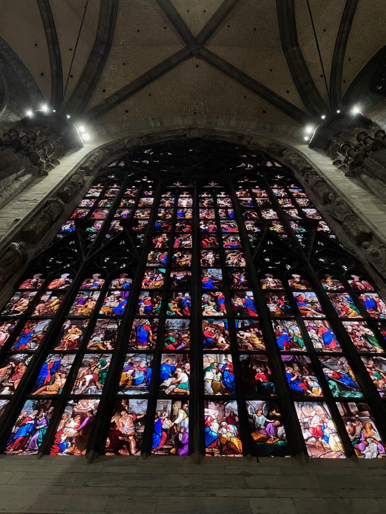
Apse windows. Due to construction, only 2 of 3 are pictured.
A closer look at one of the apse windows.

Moving towards the back of the Duomo, the highlight of the apse is undoubtedly the three gigantic stained-glass windows. Featuring elaborate stone tracery, these windows are remarkable in both their sheer size and in the ridiculous amount of detail. Taking a closer look at the windows, we could see row after row of intricately detailed scenes in stained glass, portrayed in incredibly vibrant colors and life-like characters. The rows of rectangles featuring Biblical scenes almost feel like a comic strip; just looking at it fills visitors with awe and respect.

And while at the apse, we made sure to check out the red light towards the top that highlights the container that holds the Holy Nail, the purported nail that pierced Christ on the cross; every year, the archbishop takes the Holy Nail down to ground level, where it is displayed for 40 hours before being taken back to the top of the cathedral. Certainly an interesting tradition.

Roof terraces

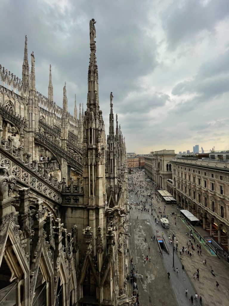
View from the Duomo roof terraces.
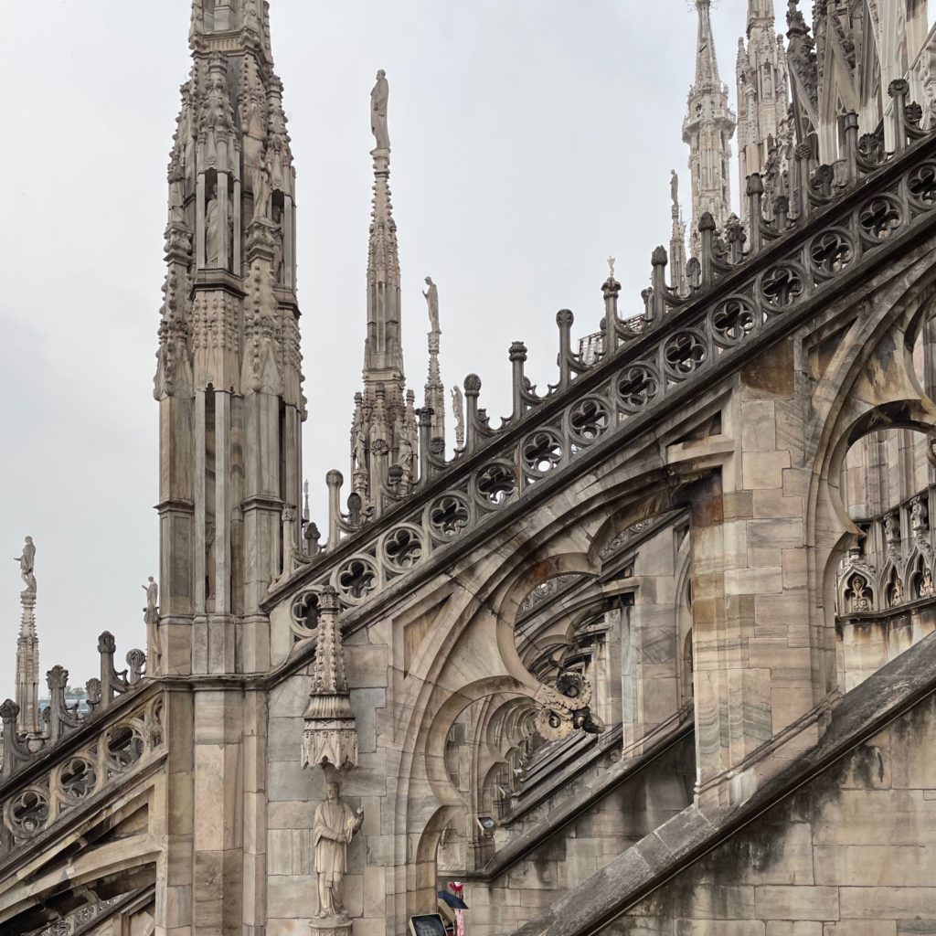
Detail of flying buttresses, seen from roof terraces. Note the intricate stone carving.

Our visit to the Duomo, though, wasn’t complete without a visit to the roof terraces. Riding an elevator to the very top, we slowly made our way under the flying buttresses. The intricately carved stone, complete with arches, trefoils, statues of saints, and Gothic spires, makes the terraces a ridiculously beautiful space. The architectural beauty combines with commanding views of Milan, complete with a great view of the Piazza del Duomo in the front.

Row after row of trefoiled arches form the flying buttresses that support the great walls of the Duomo. They are decorated not only with geometric motifs but also with statues of saints grouped together in towering spires.

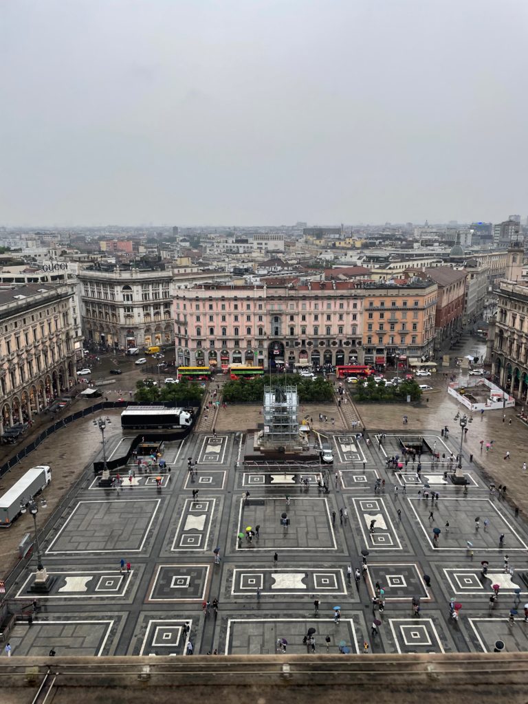
View of the Piazza Duomo from the roof terraces.
View of the Museo Duomo and Palazzo Reale from the roof terraces. The belfry of San Gottardo in Corte is visible towards the far left.

The full beauty of the view of the terraces cannot be understated, even though it started to pour rain the moment we went to the top. I would highly recommend at least a quick view of the terraces; it’s really a view you can’t miss. Any visit to the Duomo isn’t complete without a visit to the top.

Museo Duomo

Combined with properly admiring the exterior and interior of the cathedral, a visit to the terraces completes the visit to the Duomo proper. However, we made sure to also check out the Museo Duomo, which is right next to the cathedral, towards the right transept exit. 

I would highly recommend at least quickly skimming through the museum’s collections. It includes many insightful details about the full history of the Duomo, as well as many samples of art that used to be in the cathedral; fans of stained-glass, wood or stone sculpture, or just shiny things in general will enjoy the experience. Below is a small collection of some of the highlights of the museum:

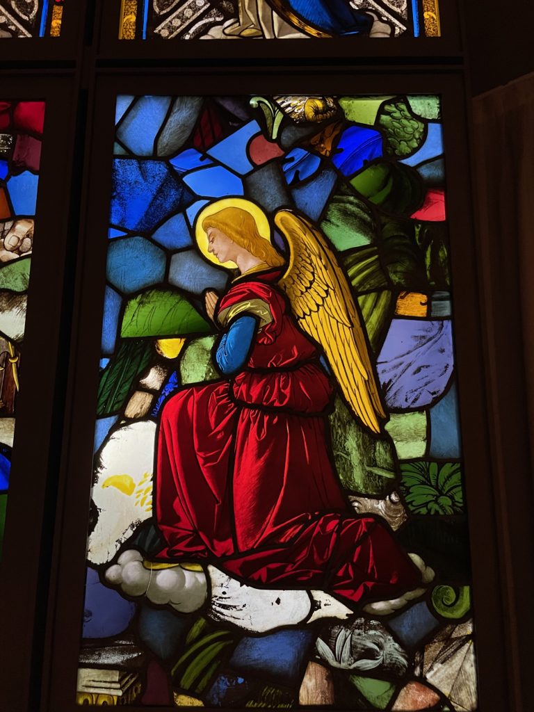
Stained-glass depiction of an angel, Museo Duomo.
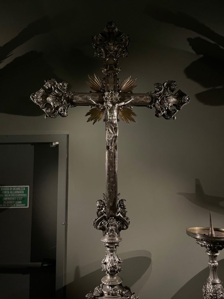
Gilt silver cross, Museo Duomo.
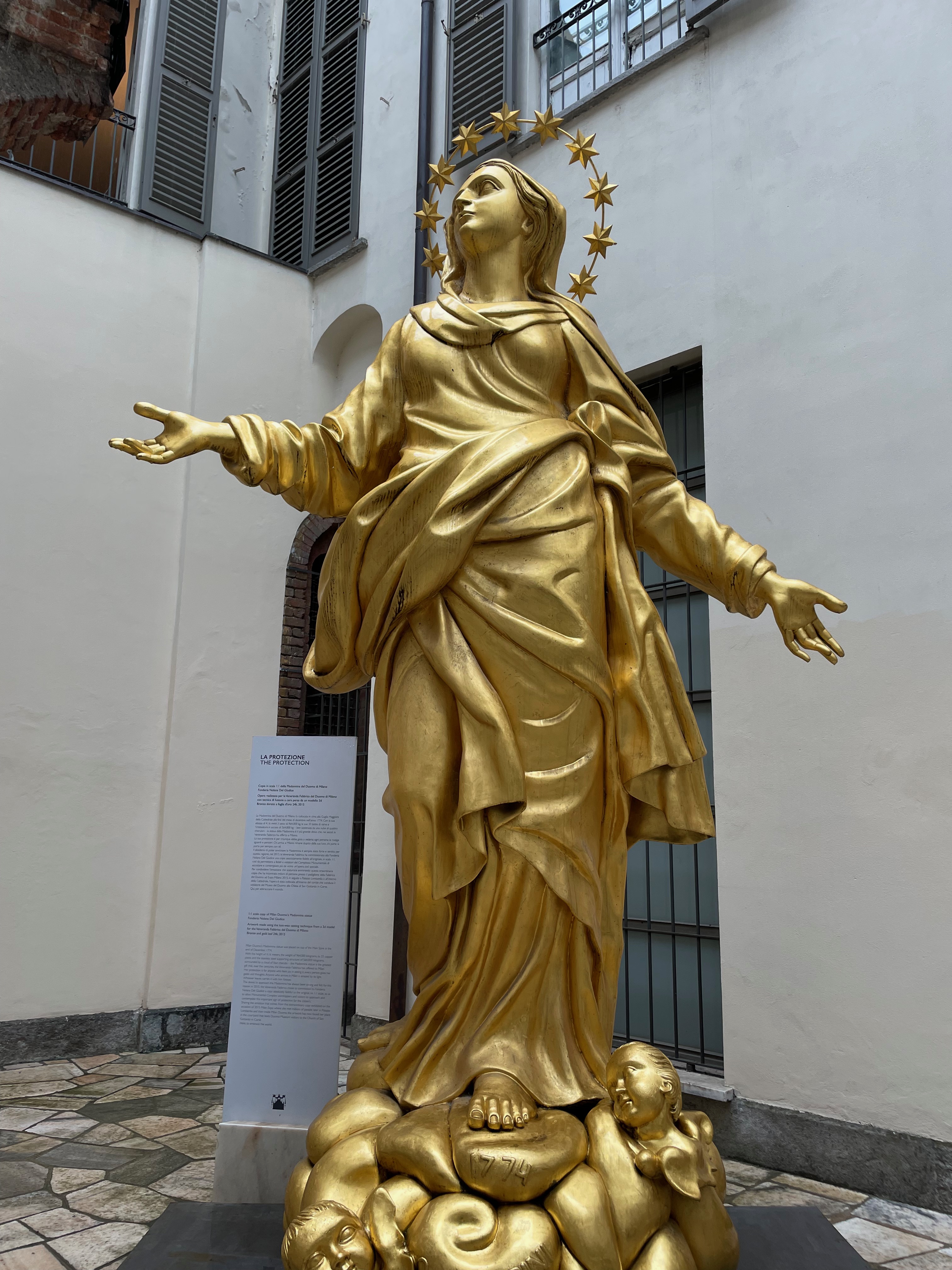
Reproduction of the Statue of the Virgin Mary on top of the Duomo, Museo Duomo.
Another stained-glass depiction of an angel, Museo Duomo.
1/20 wooden model of the Duomo, Museo Duomo.

Concluding thoughts

In a city as historically and culturally rich as Milan, the unquestioned highlight is the cathedral: in our case, the Duomo. Certainly, it is a triumph of Gothic architecture, from the gigantic stained-glass windows to the beautiful roof terrace spires.

We sought to answer the question of what makes the Duomo so special and irresistible to people all around the world. From my observation based on my visit, I could gather three reasons: history (specifically the long building time), architectural and aesthetic beauty, and sheer size.

Such a masterpiece of Western civilization should certainly be admired to its very fullest; I would highly recommend a thorough visit here if ever going to Milan. It’s definitely worth the 600-year wait.

This article is based on our visit to the Milan Duomo on June 30th, 2023.

a tale of two churches: notes on the sagrada família and santa eulalia cathedral

The following article is from our family’s travel blog, arttravel.me. It was written by me.
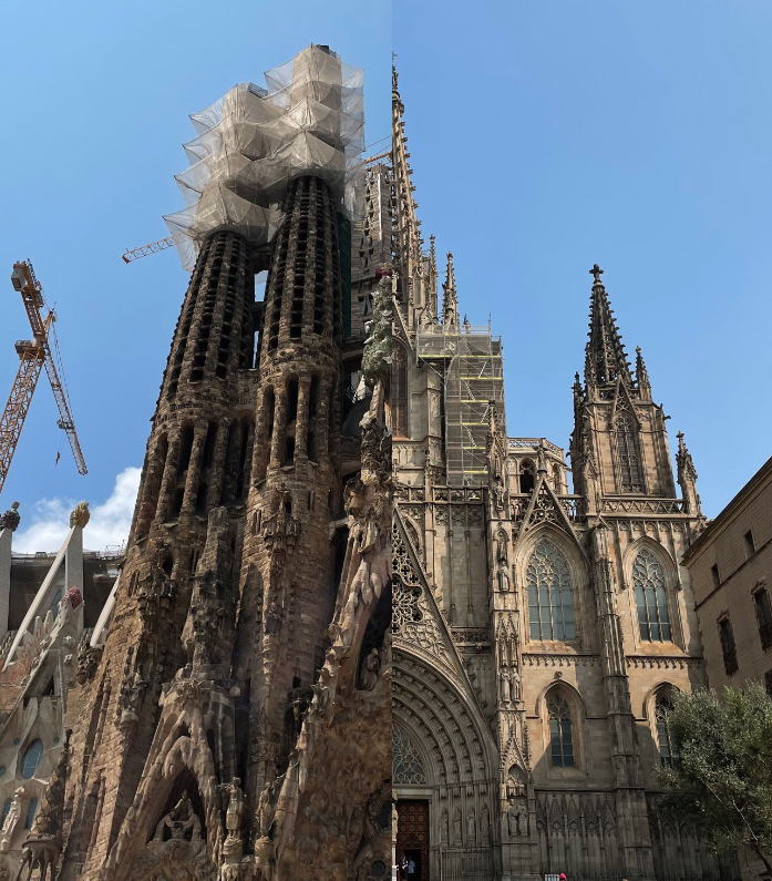
Left to right: Sagrada Família, Santa Eulalia Cathedral.

Introduction

If you ask, “What are the two most important cathedrals of Barcelona?” to anyone, they will probably answer by naming the Sagrada Família Basilica and Barcelona Cathedral (referred to here for clarity as Santa Eulalia Cathedral). And no wonder: one is Barcelona’s number one tourist attraction, bringing over three million visitors yearly, while the other was the city’s cultural and historical heart for centuries.

Which is odd, given that the two churches, at least at first glance, are wildly different from each other. One is 13th to 15th century; the other is 19th to 21st. One is primarily Gothic and neo-Gothic; the other is a riotous blend of architectural styles, described varyingly as Late Gothic, Catalan Modernist, or Art Nouveau. One is the classic image of a cathedral, imposing and austere; the other is colorful, richly decorated, and, famously, unfinished.

Given these differences, is it possible to draw any parallels between these two seemingly opposite buildings?

Exteriors

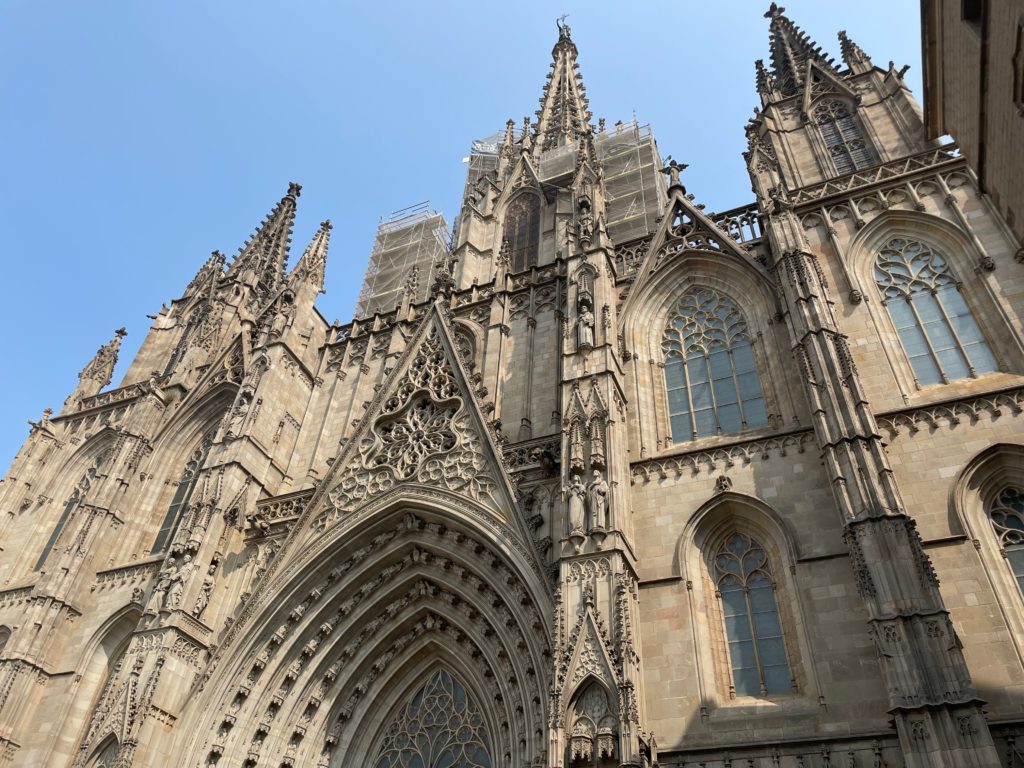
Santa Eulalia Cathedral, front façade; seen from Plaça Nova.

Of course, the part of any cathedral (and indeed, most buildings) that immediately captures the eye is the front face, of the façade. It’s also the most photographed part of the cathedral; when we visited the Sagrada Família, the spaces in front of the façades were absolutely packed with tourists snapping selfies. Although Santa Eulalia was considerably less crowded, this might have had more to do with the time we visited the cathedral (around 5 PM), as well as the considerably roomier space in front of Santa Eulalia.

We’ll start with Santa Eulalia. The front façade is unquestionably neo-Gothic, with its triple spires, its intricately carved panels, and its placement of the statues of saints… all quintessentially Gothic. I say neo-Gothic, though, because the façade actually doesn’t date back to the time the cathedral was built. In fact, the thirteenth-century western face was surprisingly simple until the late nineteenth century, when the spires were added. Overall, the façade is a classic example of the neo-Gothic.

The Sagrada Família, of course, is much more complicated than this, with its unique quirk of having three façades, all with their own unique design styles and architecture. Let’s start with the oldest face, the Nativity façade—the only face to have been completed in the lifetime of the architect, Antoni Gaudí.

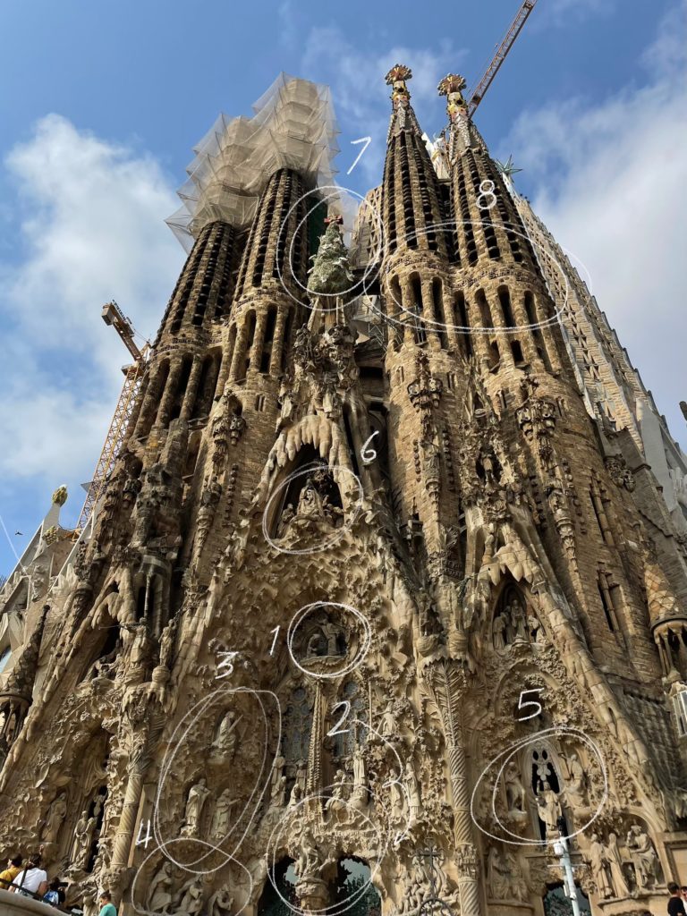
Sagrada Família, Nativity façade.

A common mistake many visitors make is the assumption that Antoni Gaudí was spiritually avant-garde, deviating from orthodox Catholic teachings, or that he was not spiritual at all. Nothing could be further from the truth. Throughout his entire life, Gaudí was a devout, sometimes fanatical, Catholic. The influence his faith had on his works can best be seen in the Nativity façade because this is the only façade that Gaudí lived to see completed. It can thus be said to be a genuine example of the architect’s vision for the basilica.

Teeming with depictions of flora and fauna, the Nativity façade is full of life and celebrates the birth of Christ. The narrative of the nativity, starting from the Annunciation (1) to the birth of Jesus (2), accompanied by a band of angels (3) and the three wise men (4), then moving on to the young Christ in the temple (5) and a humble image of the holy family (6), before being capped by a colorful cypress tree surrounded by doves (7) and the four towers bearing the word “Sanctus” (Latin for “holy”) (8), is carved with meticulous detail from stone, with many of the statues being cast from life through plaster. From painstakingly accurate depictions of people, leaves, animals, and angels, to the overall exuberance of the design, the façade feels celebratory. The overall effect of the face is one of joy and celebration of the birth of Christ.

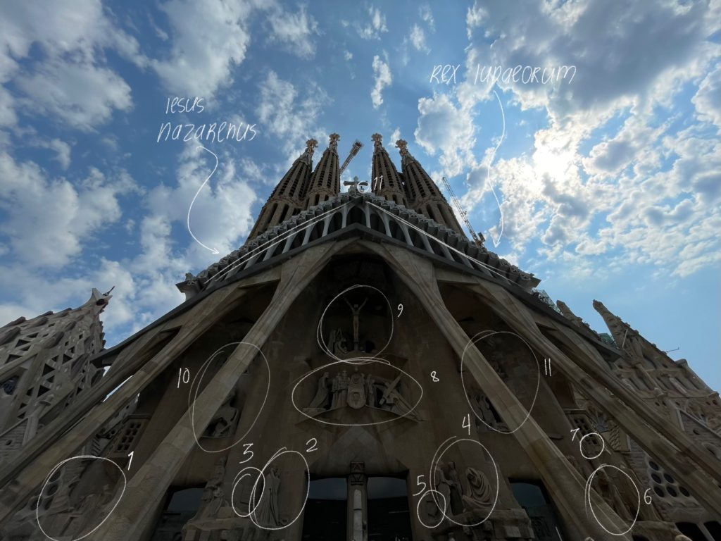
Sagrada Família, Passion façade.

In stark contrast to this vibrant and richly detailed face, the façade opposite to this, the Passion façade, is austere, bare, and sharply angular. This face of the cathedral was constructed far after Gaudí’s death, and the differences show: where the Nativity façade, telling the story of the Messiah’s entry into the world, is joyful and ornate, the Passion façade, telling the story of the Messiah’s brutal death, is bare and architecturally morose.

Like the Nativity façade, this face too primarily tells a story. The pillars are angular and resemble tendons or muscles, representing the physical aspect of Christ’s suffering. The narrative goes from the left to the right, then toward the very top. We start from the last supper (1), then towards the right to the infamous Kiss of Judas (2); the famous magic square (3) is also present, with all numbers in any direction adding up to the number 39, the age of Jesus when he died. (4) shows Peter’s denial of Jesus, with the apostle’s face wrought in grief; the rooster that crowed thrice (5) before Peter’s denial is also shown. Then it’s on to Pontius Pilate (6) deliberating during Jesus’ trial, with the Roman eagle (7) also shown.

Above the main doors, Christ’s walk to Golgotha, bearing the heavy cross, is shown (8), before the final suffering of the crucifixion (9). A stylized Roman soldier (10) and the burial of Jesus (11) are also shown. And above the whole façade, the words “Iesus Nazarenus Rex Iudaeorum” are written: this is Latin for “Jesus Christ, King of the Jews”, and was the message written above Christ’s head when he was crucified. But even in this bleak story, hope is not lost: a small statue of Jesus (11) is perched in between the four towers, representing his ascent into heaven.

And finally, although we didn’t have a chance to see the final, main face of the Sagrada Família, the Glory façade, construction on it has barely started, so we really didn’t miss much.

Overall, the faces of the Sagrada Família are much more narrative-driven than the façade of Santa Eulalia; whereas the faces of the former are built with the purpose of telling a grand, overarching story, the face of the latter was built with decoration in mind, not with narrative. And while the façade of Santa Eulalia is built with a single style, every face of the Sagrada Família is different.

This speaks to the length of time it took to build the respective façades. The unity of style present in the face of Santa Eulalia is unusual in most Gothic cathedrals; it’s due to the comparatively short time it took to build the façade separately. The opposite is true in the Sagrada Família, where the unity of style in the three faces of the building isn’t present because of the time it took to build them.

Interiors

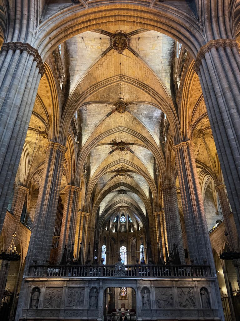
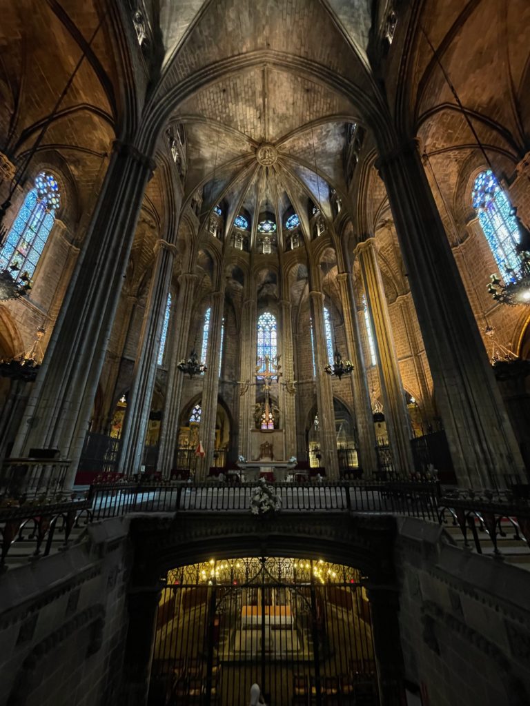
Nave of Santa Eulalia Cathedral, viewed from the entrance towards the apse.
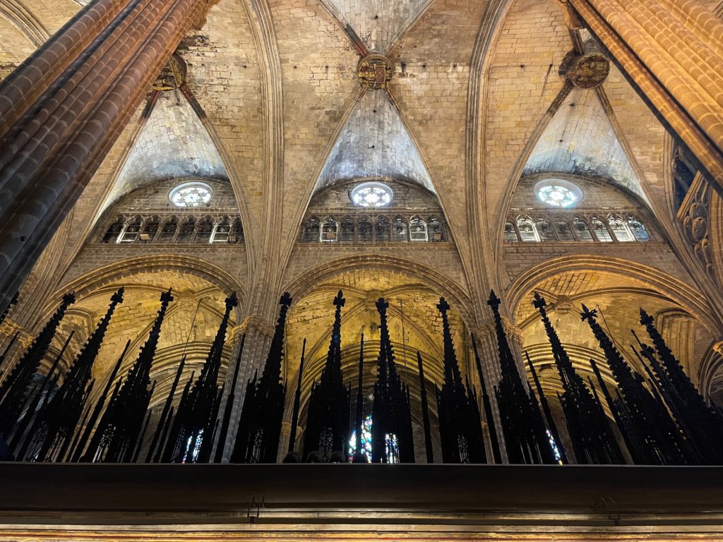
Detail of the ceiling of Santa Eulalia Cathedral. Note the rib vault structure.

Visiting Santa Eulalia, we are immediately greeted by the nave, the vertical part of the cathedral’s cross structure, since the main entrance is there. The giant columns, stacked in tiers, support a brick rib-vaulted ceiling, a classic hallmark of Gothic cathedrals. The pointed Gothic arch is prominent throughout the building; some natural light comes through the windows, more prominently in the apse than in the nave, but most of the lighting is artificial. The interior of the cathedral seems dark, almost gloomy: this may be because of the cathedral’s position in Barcelona’s Gothic Quarter, where it is surrounded by buildings that block natural light from coming through the windows.

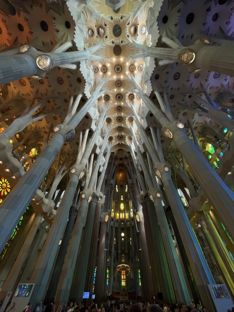
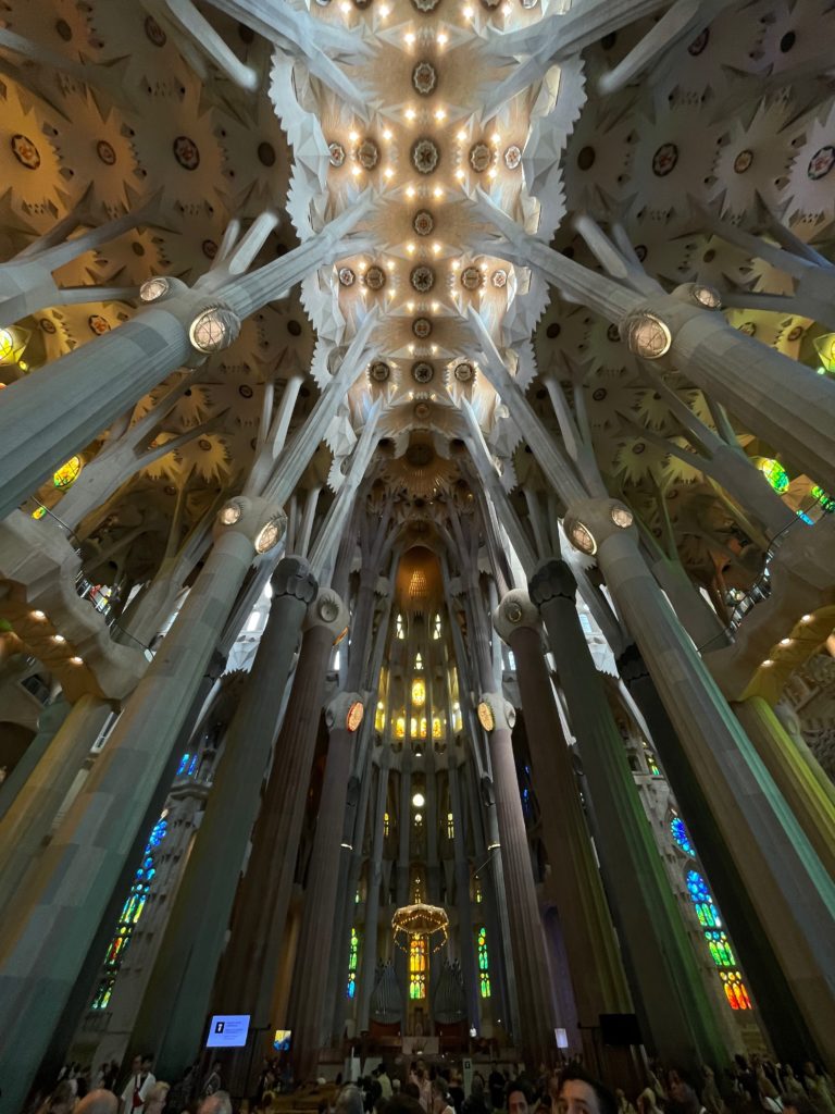
Detail of the ceiling of the Sagrada Família. Note the more naturalistic, “flowering” design.

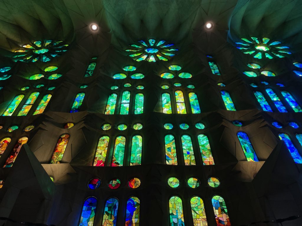
In contrast to Santa Eulalia, the main entrance of the Sagrada Família is at the transept (the Nativity façade is at the right side of the transept), so visitors have to walk to the front of the cathedral to view the nave, as the main doors have not been opened yet. The most striking aspect of the Sagrada Família is unquestionably its color, coming from the Barcelona sunlight that passes through vibrantly colored stained-glass windows; it’s unquestionably natural, which may be due to the basilica’s position in the more rigidly planned Eixample district, where it towers above many residential buildings; more light can thus filter through, allowing for a brighter interior than that of Santa Eulalia.

Another striking detail is the design of the columns; unlike the classic tiered stone pillars that hold up pointed arches in Santa Eulalia, the columns of the Sagrada Família branch out towards the top and support a flowered ceiling (or perhaps a symbolic representation of a canopy of leaves) and, towards the top, a series of catenary arches. This design, combined with the fact that the sheer height of the basilica makes the columns look slender—in reality, they are incredibly wide—gives the feel of a stone forest, where the columns become naturalistically designed trees supporting fluid and non-rigid structures.

Stained glass windows of Santa Eulalia Cathedral, seen from the choir.
Stained glass windows of the Sagrada Família, seen from the nave side aisle.

Despite these differences, there are similarities between Santa Eulalia and Sagrada Família. The most prominent of these are the windows; both have fine stone tracery and a “rose” design, another hallmark of Gothic stained-glass windows. The windows of the Sagrada Família are overall more colorful, with a far greater selection of shapes and pieces than the windows of Santa Eulalia. However, they do feature the shape of the Gothic arch, in contrast to the catenary arches that are prevalent throughout the basilica.

Apse of Santa Eulalia Cathedral.

Moving to the front of the cathedral, we come to the apse, perhaps the most important part of any cathedral: this is where services are held, where the speakers preach, and where the high altar is found. 

For Santa Eulalia, the continuity of the space of the apse is partially disrupted by the entrance to the crypt, which is unusually in the open and sudden. This is where the namesake of the cathedral, Saint Eulalia, is buried. Behind the entrance is the apse proper, where the altar is. Compared to other cathedrals we visited, such as Toledo Cathedral, the apse of Santa Eulalia was surprisingly sparse; the main visual highlight of the space is the hanging sculpture of the crucified Christ surrounded by angels. The round walls of the apse feature lovely stained-glass windows, featuring the aforementioned tracery and rose shape of the classic Gothic style. 

Apse of the Sagrada Família.

As a basic starting point, the apse of the Sagrada Família—indeed, the entirety of the Sagrada Família—is far larger than that of Santa Eulalia. As such, the apse simply feels more impressive; combined with the effect of the technicolor stream of light, it contrasts sharply with Santa Eulalia. 

In the center of the apse is a hanging baldachin, or the canopy under which the bishop sits. Under it is another depiction of the crucifixion; coincidentally, it also floats off the ground in an almost abstract form. Behind the altar space are two organs, not present in Santa Eulalia, which play every half-hour or so. The sound of the pipes echoing through the basilica is a truly ethereal experience. Finally, the crypt, where Gaudí himself is buried, is situated directly under the apse, with a much subtler entrance than Santa Eulalia. 

The traditional structure of the apse, that is, the reservation of the focal point of the nave and transept for the holiest space of the church, is the common tangent that ties the spaces of the two buildings together. Besides the altar, the hanging sculpture of the crucified Christ, and the elevated platform, it may seem hard to draw parallels between the two spaces. After all, Santa Eulalia doesn’t have the double organs that the Sagrada Família boasts; nor does it have the uninterrupted seating space that allows all eyes from the nave to be drawn to the apse.

But although these differences are important, it’s also important to note the many common architectural points that Antoni Gaudí intended in his work. As mentioned previously, the stained-glass windows are similar throughout the two buildings; the similarity is most prevalent in the apse, where the tracery and rose shapes especially shine through. And no wonder: in both buildings, the apse is the brightest part of the church. Finally, in both buildings, one of the most important people of the church is buried directly under the apse. For Santa Eulalia, it is its namesake; for the Sagrada Família, it is its architect. An affirmation of Christ’s triumph over death, perhaps, or a sign of honor. 

Concluding thoughts

Santa Eulalia Cathedral and the Sagrada Família: Barcelona’s two great churches. One is a hallmark of medieval Gothic, the other is a hodgepodge of different styles over different decades. One is dark and solemn, the other is bright and airy. One is smaller and attracts fewer, the other is larger and attracts multitudes more. The differences go on.

Make no mistake, though: both are firmly grounded in Catholic tradition, architectural stability, and above all, faith. Though they may express it in radically different ways, at the end of the day, both buildings deserve a judgment on equal footing. They are both, in their own ways, beautiful statements of belief.

This article is based on our visit to the Sagrada Família and Santa Eulalia Cathedral on June 27th and 28th, 2023, respectively.

where cultures collide: notes on toledo cathedral

The following article is from our family’s travel blog, arttravel.me. It was written by me.

Introduction

Before Philip III moved the capital of Spain to Madrid in 1561, the ancient city of Toledo, with its highly fortified riverside location and sturdy stone walls, was the original capital city of the Spanish Empire. Small wonder, then, that it boasts one of the greatest cathedrals in the world, the Primatial Cathedral of Saint Mary of Toledo (Catedral Primada Santa María de Toledo), also known as Toledo Cathedral.

Toledo Cathedral, seen from Plaza del Ayuntamiento.

Built for more than 250 years, the cathedral is a shining example of Spanish High Gothic architecture, although it incorporates aspects of the Baroque, Rococo, and Mudéjar styles as well. Today, Toledo Cathedral’s beauty and imposing grandeur continue to draw tens of thousands of tourists to the city, centuries after its stones were laid.

So what makes Toledo Cathedral so special, and how does it continue to attract and inspire people hundreds of years later?

Toledo

To properly understand Toledo Cathedral, we first have to look at the city of Toledo itself.

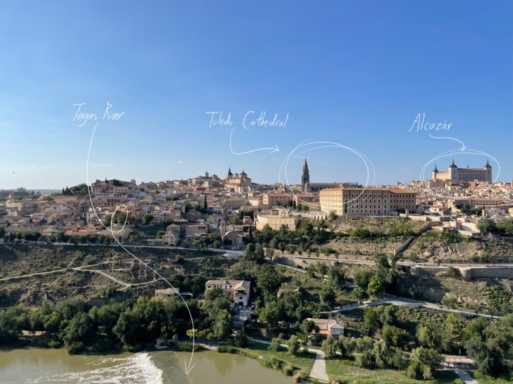
Toledo, seen from the Mirador Toledo.

As seen by the image above, Toledo sits on a hill facing the Tagus River, easily defensible by walls. This naturally advantageous position for a city was recorded as far back as ancient Rome; the Roman historian Livy writes of Toledo as “a small city, but fortified by location” as early as the first century AD. It is not surprising, therefore, that Toledo first served as the capital city of the Visigothic Kingdom from 542 to 725 AD, a period of almost 200 years; nor is it surprising that Holy Roman Emperor Charles V centered his court on Toledo. Indeed, Toledo was Spain’s de facto capital city until Philip III moved the capital to Madrid due to a lack of space.

As the greatness of the city grew throughout the years, the need for a grand cathedral arose. It’s important to remember that cathedrals in Europe are designed to be the focal points of their cities; they’re designed specifically to instill awe and grandeur in the viewers. So, considering both the illustrious history of the city and the need for grandiosity in cathedrals, the grandeur of Toledo Cathedral comes as less of a surprise.

Exterior

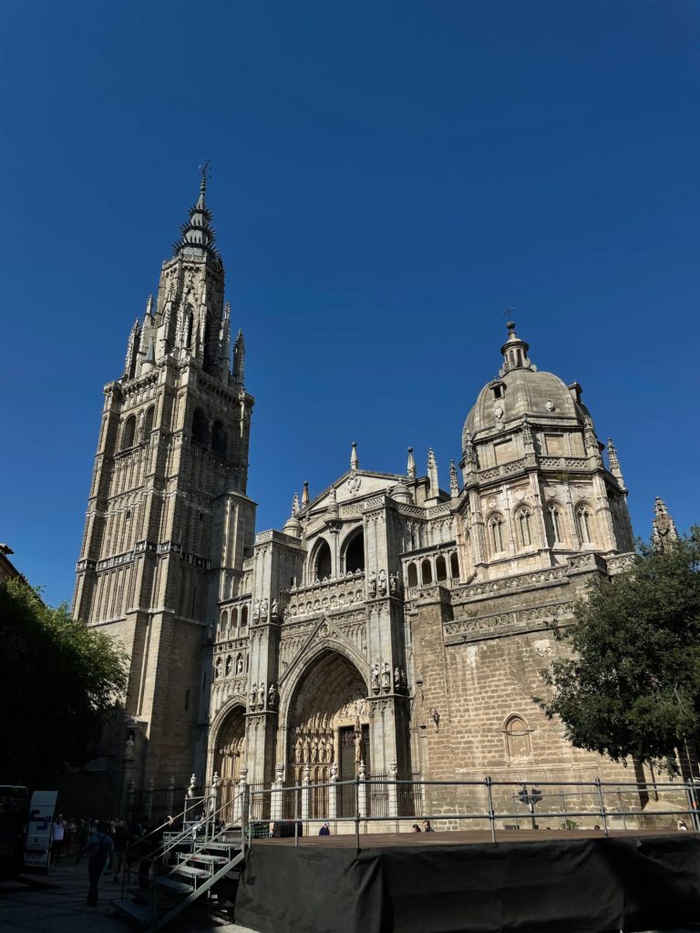
Front façade of Toledo Cathedral, seen from Plaza del Ayuntamiento.

Toledo Cathedral is often called the crowning glory of Spanish High Gothic architecture, and this title clearly shows in the exterior of the building, specifically in the front façade.

To start, the three-portal design of the front (1) is a very clearly Gothic form of cathedral architecture. The cathedrals of Notre Dame de Paris, Amiens, Rouen, and Reims, to name just a few, all have three portals. The trefoil designs of the arches (2), as well as the stone tracery of the arches, both are descended from the Gothic style. And of course, the classic Catholic iconography of carved images of Christ and statues of the saints in niches (3) speaks to the cathedral’s purpose.

On the other hand, some elements of the cathedral’s exterior are influenced by the Mudéjar style, which utilizes Islamic-derived elements in Iberian architecture. For example, the elaborately carved stone patterned railing on the top of the façade (4) is in the mudéjar style, as is the brickwork of the left belfry (5). Overall, however, the mudéjar style does not become immediately apparent from the front.

On the topic of the belfry, one of the more unusual aspects of Toledo Cathedral is its seemingly mismatched and asymmetrical towers. The taller tower on the left is a bell tower (6), but the tower on the right is a chapel (7) (whose octagonal dome was designed by Jorge Manuel Theotocópuli, son of the famous painter El Greco), used specifically to house a worship place for the Mozarabic rites. These rites were once used throughout the Iberian peninsula and were kept alive by the Christian communities under Muslim rule in Al-Andalusia, or the Mozarabs. The Mozarabic rite is still kept alive today, especially in Toledo, where the rite is still celebrated in the chapel to this day.

From the grand and elaborate front façade, we come into the interior of the cathedral itself.

Interior

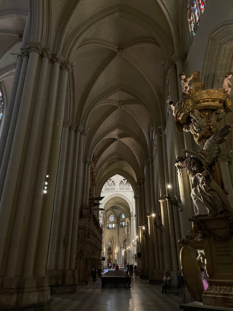
Interior of Toledo Cathedral, right side aisle, nave.

The nave of Toledo Cathedral is a quintessential example of High Gothic architecture. From the colossal columns supporting the rib vaults to the stained glass windows and the gigantic rose window, the front of the cathedral is almost entirely in the Gothic style. Here, the pointed shape of the Gothic arch is prevalent, as is the cross shape of the rib vault. The front is dark, almost gloomy, lit by artificial lights and sunlight streaming through the stained glass.

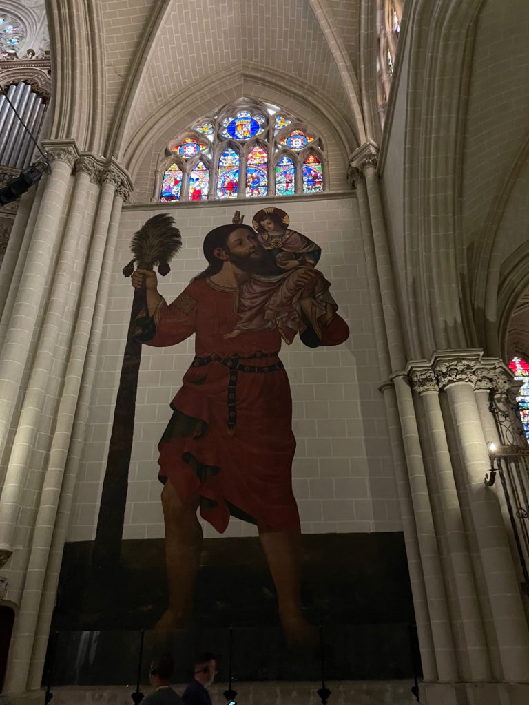
Wall painting of St. Christopher carrying the infant Christ, on the side of the transept entrance.

As we move forward from the side aisle of the nave to the side of the transept entrance, an unexpectedly large wall painting is shown of a bearded man carrying a child. The subject of the painting is also large within the settings of the painting; his “staff” is a palm tree. This is St. Christopher; legend has it that he carried the (miraculously heavy) infant Christ across a river, curing him of his pride and causing him to devote the rest of his life to Christianity.

Choir of Toledo Cathedral.

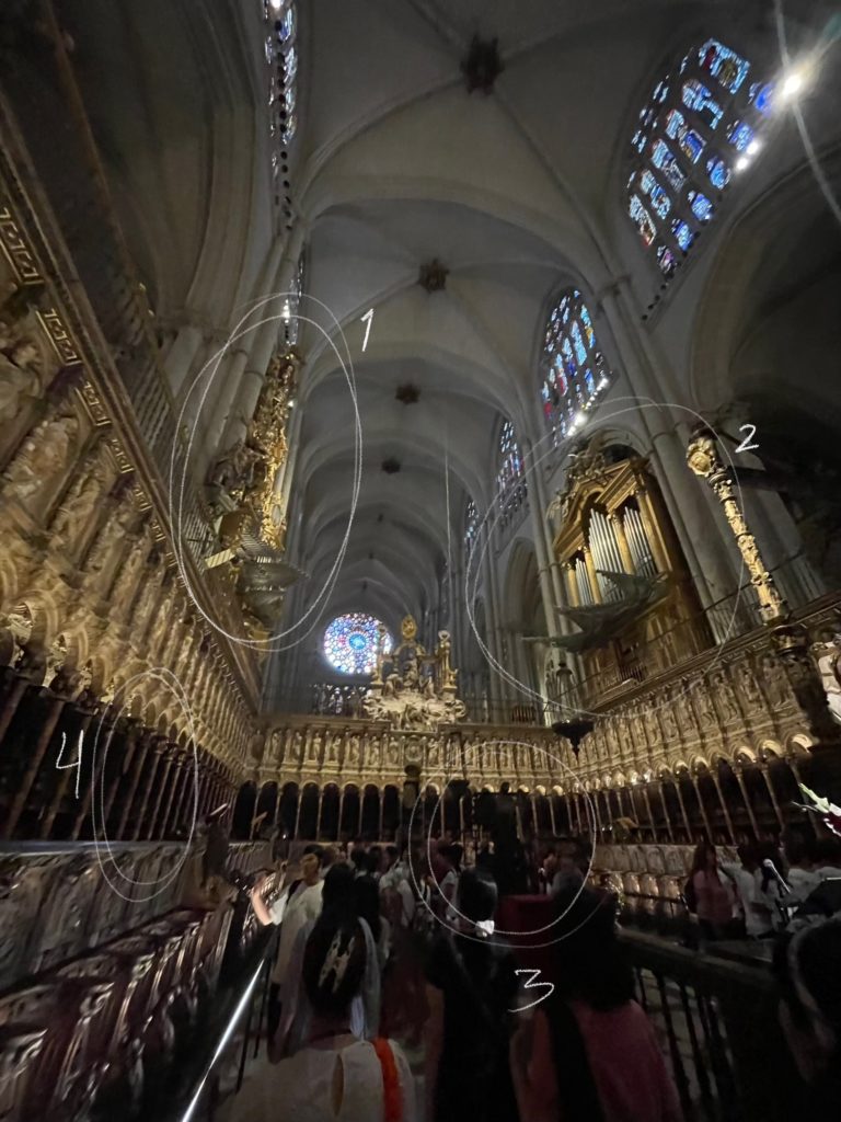
Near the transept is the choir space, where the choir sings during services. The two gigantic organs are immediately visible, their pipes sticking out like cannons; the one on the left (1) is in the ornate Baroque style, while the one on the right (2) is in the more recent and austere Neoclassical style. The choir therefore already features a convergence of styles, blended smoothly so that all methods are encased in the overall “look” of the cathedral.

But how would the organ players get to the organs themselves, which are far above the rest of the choir? The answer lies in the back panels behind the columns; look closely at the panels behind the stairs, and you’ll see that they are in fact secret doors (4), which lead directly to the seats where the organists would play their hymnals.

The inner space is surrounded by three series of arches; this is where the choir sits, underneath the rows of statues of Biblical patriarchs and saints encased in individual niches. And of course, the gigantic lectern (3), where the conductor read from the gargantuan sheet music, is in the very center of the space itself. And make sure not to miss the statue of the Virgin Mary at the front of the gates, facing the apse and chancel.

Altarpiece of Toledo Cathedral.

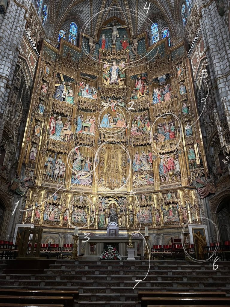
Behind iron bars, the chancel contains one of the most elaborate and dazzling altarpieces of any Gothic cathedral. Consisting of six golden tiers containing colorful scenes from the life and death of Jesus, this altarpiece is simply magnificent. Avid-eyed visitors can spot some iconic allegories and stories here; starting slightly left of center with the Annunciation (1), or the visitation of the angel Gabriel to the Virgin Mary; then moving to the top-center with the Nativity (2); then moving immediately to the Passion with the Last Supper (3) and Crucifixion (4). Finally, the story concludes with the continuation of the message of the Gospels, showing the Holy Spirit descending on the Apostles (5). Golden and polychromatic, this altarpiece is a beautiful triumph of medieval art—and consider also the fact that all of these sculptures are life-sized. Impressive indeed!

Take a close look at the painting in the bottom-right corner (6), and you’ll notice that it has hinges. That’s because it’s another secret doorway, which leads to none other than the center of the altar, the monstrance (7).

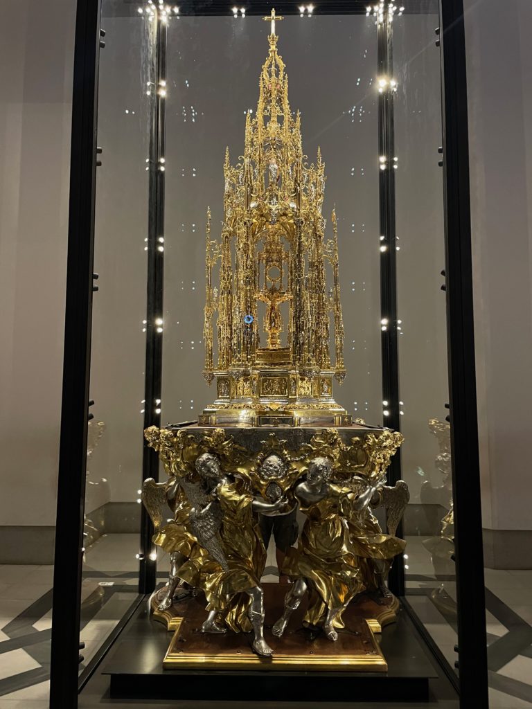
Of course, from way down below at ground level, the figures look miniature and the monstrance looks very small. But seeing the monstrance at eye level, we can see that it is, in fact, a gilt-silver tower. A closer look can be achieved by going to a separate room, where the original monstrance (the one in the altarpiece is a replica) is in a display case.

The monstrance of Toledo Cathedral.

Supported by angels and towering above, it truly looks like the giant achievement that it is.

But what is a monstrance? In short, it is the vessel in which the Eucharistic host (which is the sacramental bread you see in Communion services) is placed; in Toledo’s case, the host is placed within the (comparatively) tiny circular holder in the center of the monstrance. It truly can be called the centerpiece of the centerpiece.

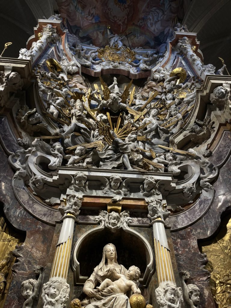
El Transperente, towards the back of the apse.
The hole in the ceiling illuminates El Transperente with natural light.

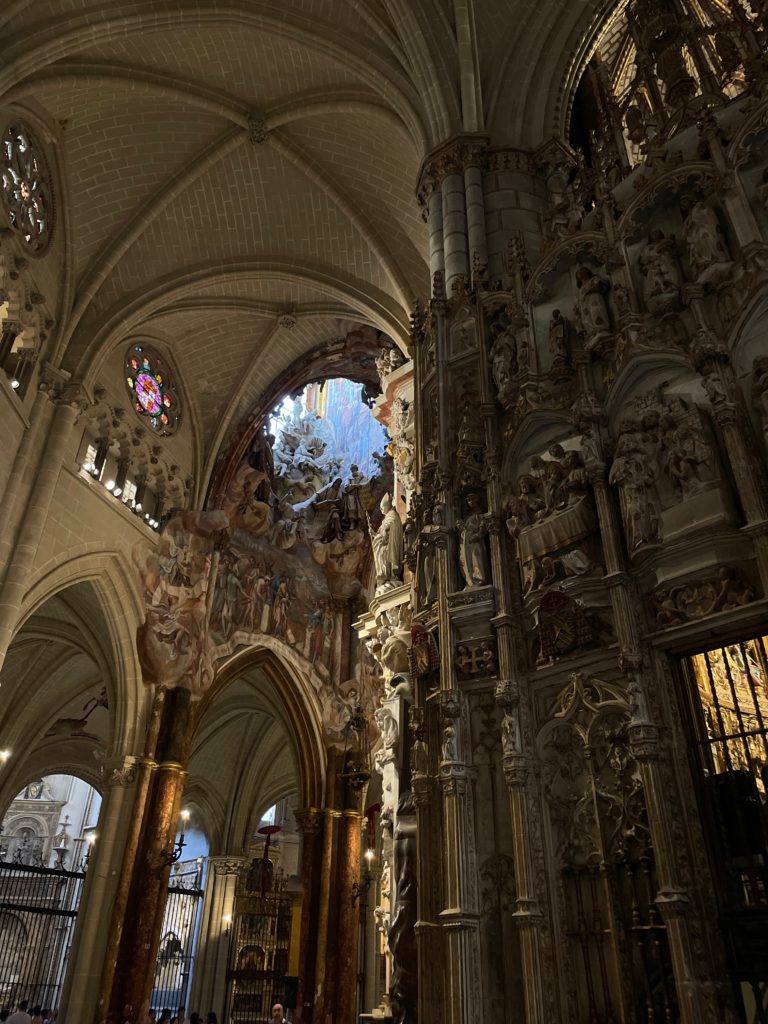
Moving on, the altarpiece behind the gilded wooden sculptures is equally as impressive. Known as El Transparente, this gigantic altarpiece is a true triumph, this time of the Baroque style. In a fantastic dreamscape cut from marble, angels and cherubim fly wildly through gilded shafts of light coming from the Eucharistic host, in a style perhaps influenced by Bernini’s famous Throne of Saint Peter in the Vatican, while the Virgin and child sit humbly at the bottom.

The golden rays emanate from none other than the previously mentioned monstrance, where the Eucharistic host sits as if the body of Christ itself radiates shining light. 

The real genius of El Transparente, however, lies in the way the sculptor designed natural light to hit the altar. In a dark cathedral such as this, especially in the very back of the church, where it’s hard for light to hit the altar, the illumination of the altar proves to be difficult. However, in a stroke of genius, the sculptor found the solution to lighting the piece by cutting a hole into the ceiling. This striking and unusual detail ends up working out very well: the light that hits this baroque masterpiece is completely natural. And, when the time of day and year are just right, the light is perfectly angled so that a single beam hits the Eucharistic host in the very center of the altar.

Annexes and cloisters

Towards the left of Toledo Cathedral, the entrance to the annexes are visible. Here, precious works of art by masters such as El Greco, Titian, Raphael, Caravaggio, and (in an unusually religious painting) Goya, are all on display. The most notable of these masterpieces, of course, is El Greco’s The Disrobing of Christ.

The Disrobing of Christ by El Greco, on display in the annex rooms.

Notice the striking (and at the time controversial) composition of the painting. Instead of Christ being at the very top of the painting, he is instead on the ground, surrounded by the people about to execute him. The drawn-out and elongated anatomy of the figures, especially visible in the man carving the cross and the figure of Jesus himself, is also very striking, especially as you get closer to the painting. Finally, the decision to only make Christ’s eyes glimmer white as he turns his face to heaven is deeply moving.

Before going to the cloisters, I would recommend taking some time to admire the other masterpieces that are on display in the annex rooms, which include Titian’s Portrait of Pope Paul III, Raphael’s The Virgin of the Veil, Caravaggio’s Saint John the Baptist, and Goya’s The Arrest of Christ, an unusual subject matter for the artist, as mentioned above.

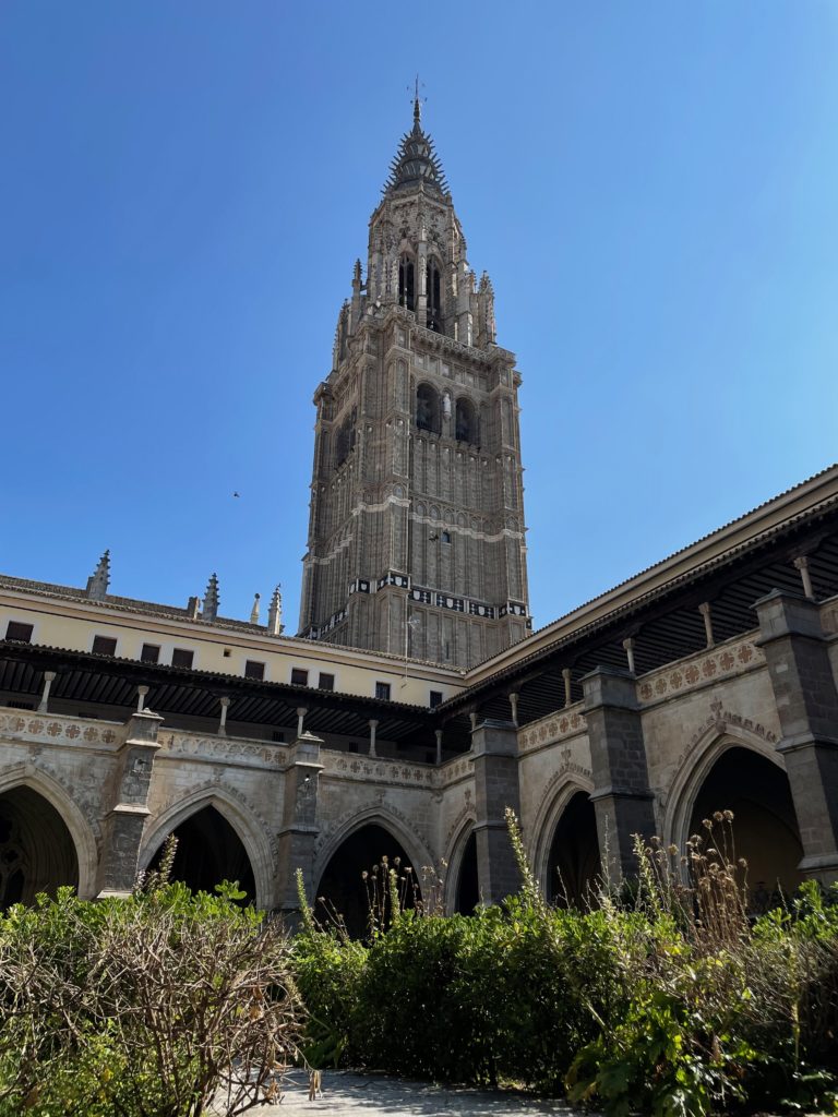
Concluding the visit to Toledo Cathedral, make sure to swing by the cloisters before you leave. Here, the herbal scent and cool shade of the arches make for a lovely atmosphere, and the view of the belfry isn’t bad, either. When we arrived, hardly any tourists were milling about the cloisters, so it makes for a nice place to rest for a minute if you don’t mind the suffocating heat.

View of Toledo Cathedral’s belfry from the cloisters.

Concluding thoughts

Toledo Cathedral is unquestionably a must-see for any visitors to the city. From its gorgeous exterior to its jaw-dropping interior, it speaks as a convergence of several different artistic and architectural styles. The influence left by the Moors, the Mozarabs, and the Spanish is carved indelibly in rock, the product of centuries worth of progress and innovation.

As a prime example of cultural synthesis, the cathedral really is an unquestionably unique and beautiful location. Where cultures collide, here beauty has sprung.

This article is based on our visit to Toledo Cathedral on June 23rd, 2023.